


KEY VISUAL
Tokyo University of Science ~ Nobel Prize Celebration Banner
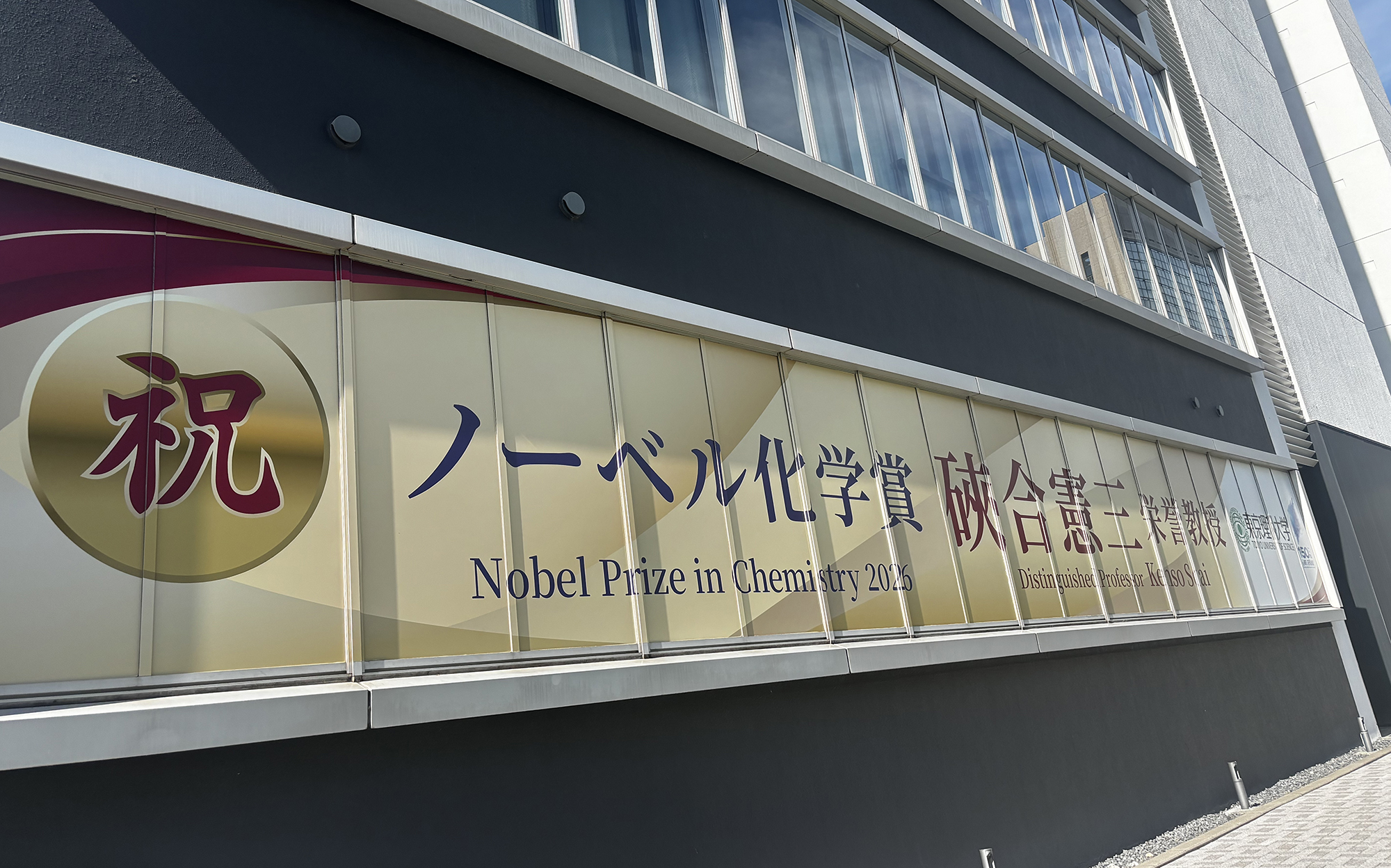
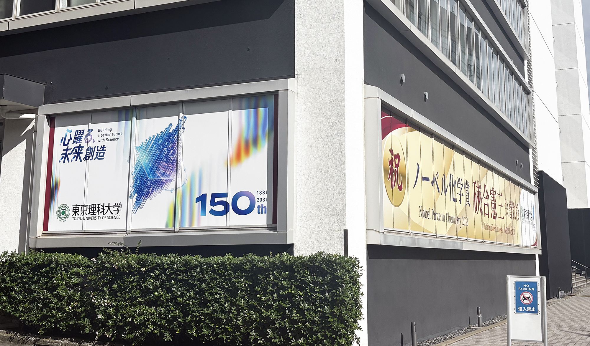
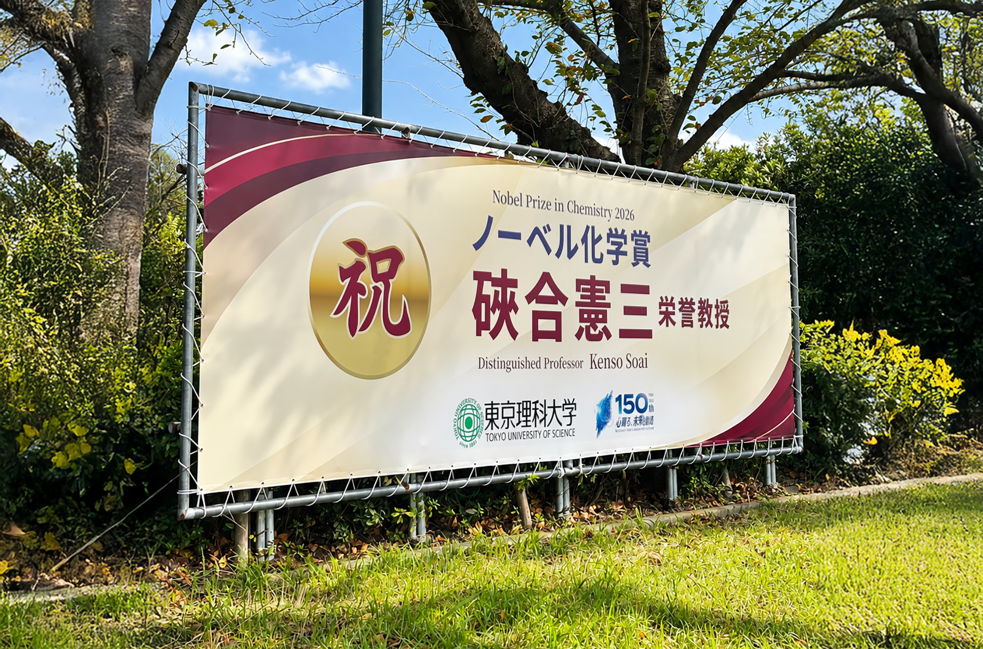
佐野の母校でもある東京理科大学よりご依頼いただき、2026年ノーベル化学賞受賞を祝う記念横断幕のアートディレクションおよびデザインをSMDOにて担当しました。
大学の伝統と格式を大切にしながら、受賞の栄誉と祝福を表現したデザインに仕上げています。
SMDO was responsible for the art direction and design of a commemorative banner celebrating the 2026 Nobel Prize in Chemistry, commissioned by Tokyo University of Science, Sano’s alma mater.
The design honors the university’s rich history and prestige while expressing the significance of the award and the spirit of celebration.
Art Direction : Minami Sano(SMDO)
Assistant Direction : Shinnosuke Nakasone(SMDO)
Chief Graphic Designer : Yuichi Ikehata(SMDO)
Graphic Designer:Shigeo Sato(SMDO)
東京理科大学 担当事例
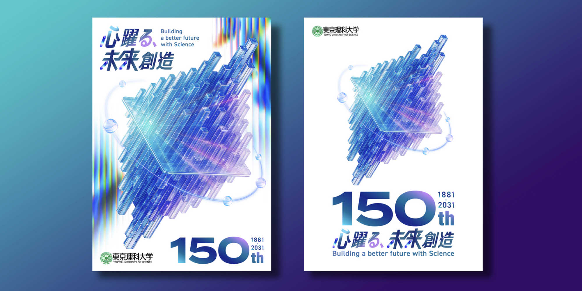
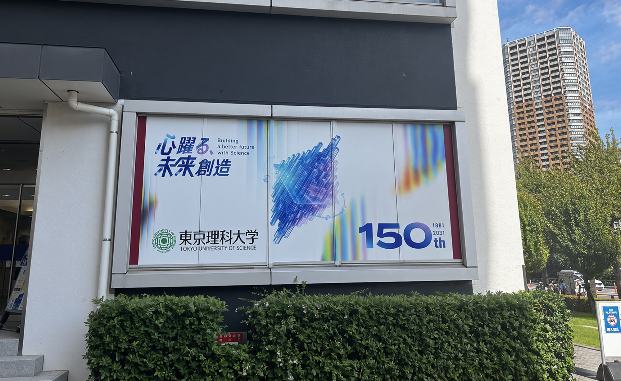
150周年事業ロゴとキービジュアルのビジュアルコンセプトとロゴデザインの考案、アートディレクション、デザインをSMDOにて担当させていただきました。また制作グッズとしてポスター(2種類)、クリアファイルのアートディレクションとデザインも担当させていただきました。
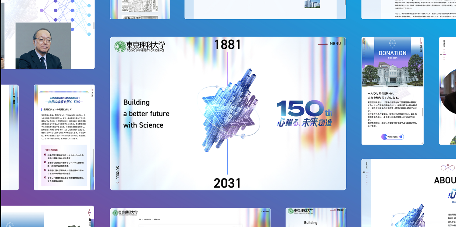
Tokyo University of Science ~ 150th Anniversary Website
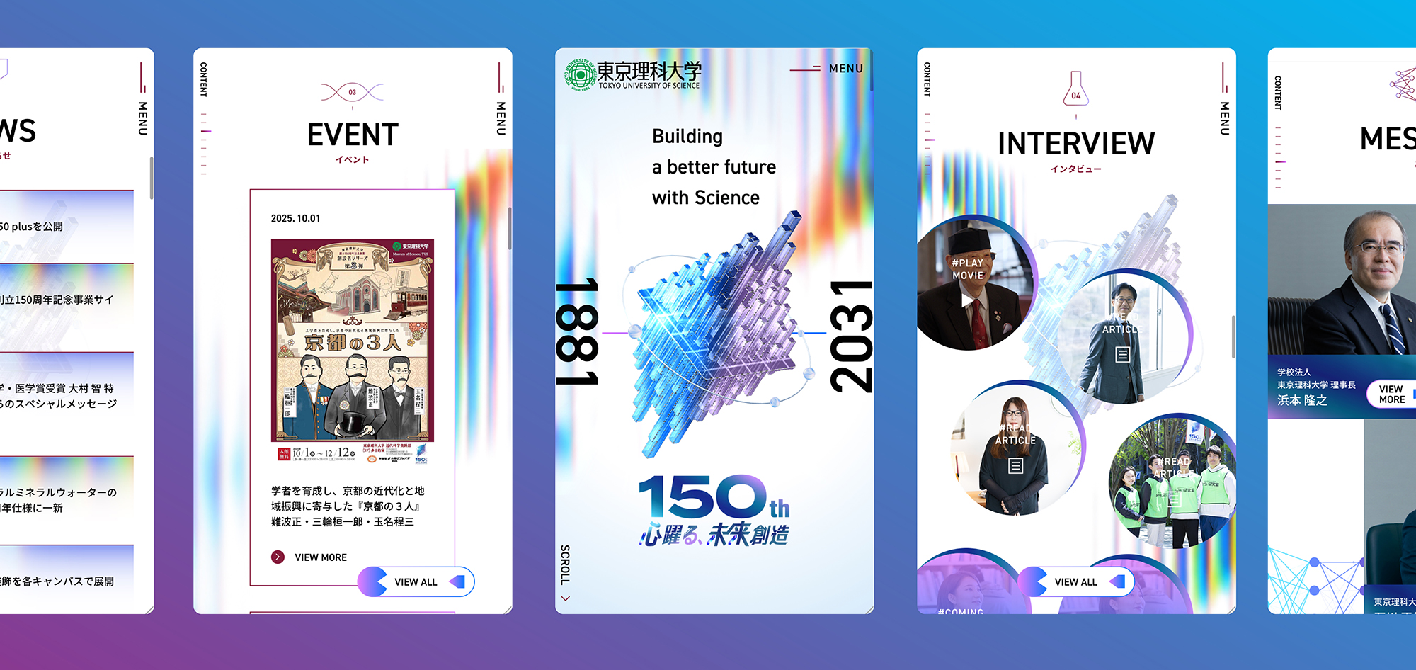
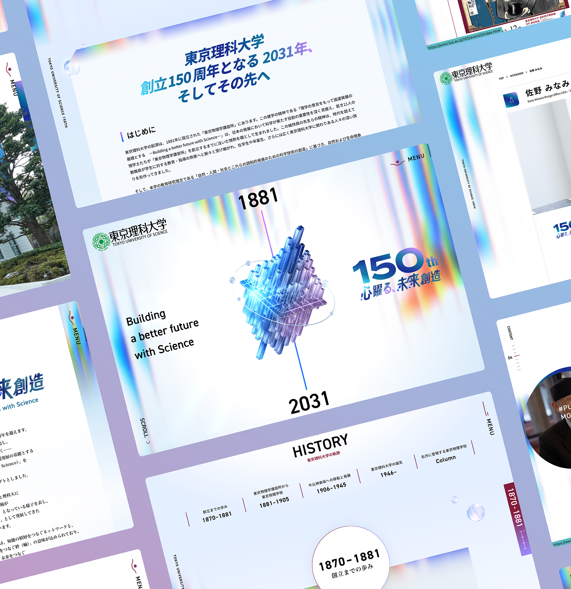
東京理科大学150周年サイトのWEBデザインも担当しております。理科大ならではのギミックや遊び心を随所に取り入れ、150年の歴史とこれからの未来を感じられるWEBサイトを目指しました。
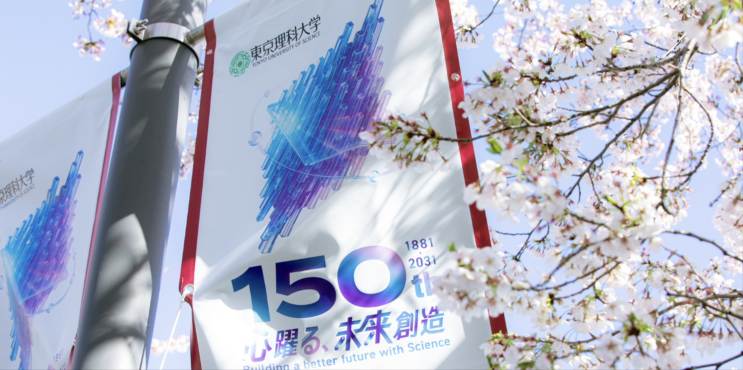
Tokyo University of Science ~ Flag & Sign
フラッグ、看板のアートディレクションとデザインを担当させていただきました。。現在、野田キャンパスと葛飾キャンパスに掲載されております。
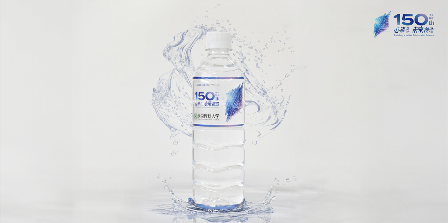
Tokyo University of Science ~ Plastic Bottle Label
「東京理科大学 ナチュラルミネラルウォーター」のラベルのアートディレクションとデザインも担当しております。キャンパスの販売店(生協等)、自動販売機で販売中。
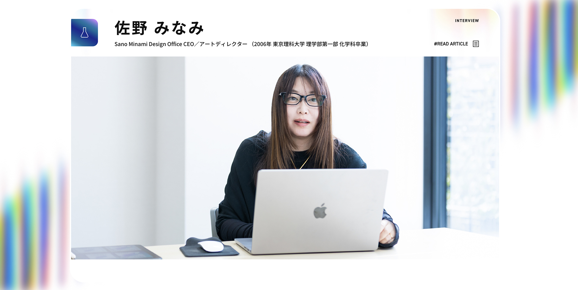
Tokyo University of Science ~Interview
東京理科大学150周年サイトのWEBデザインを担当しました。
サイト内のインタビュー企画では、卒業生や教職員、学生それぞれの視点から、東京理科大学で培われてきた経験や学び、そしてこれからの未来について紹介しています。
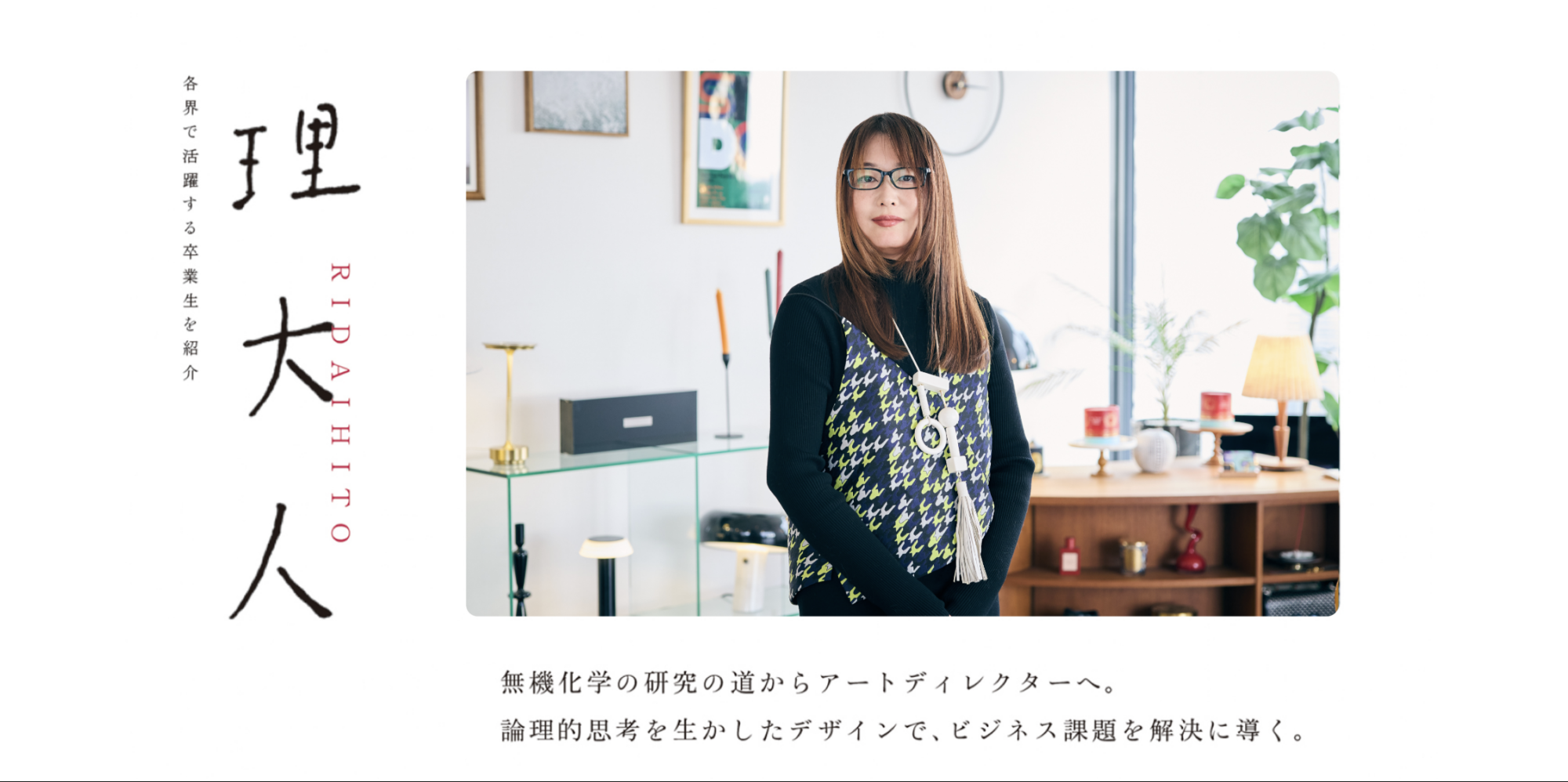
Tokyo University of Science ~ RIDAIHITO
佐野の母校である東京理科大学様から取材のご依頼をいただき、東京理科大学報 第237号に掲載される「理大人」のコーナーでインタビューが公開れております。
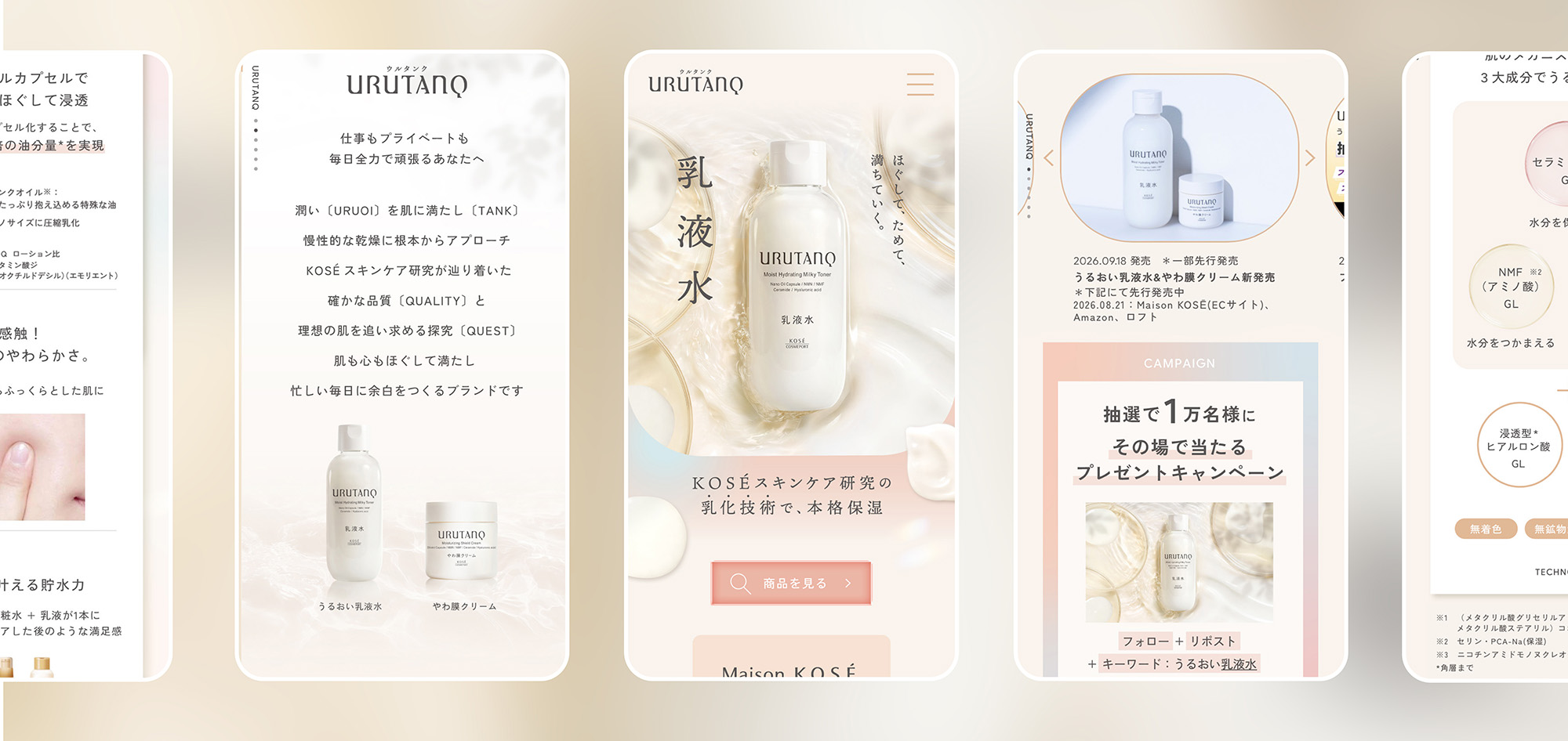
URUTANQ
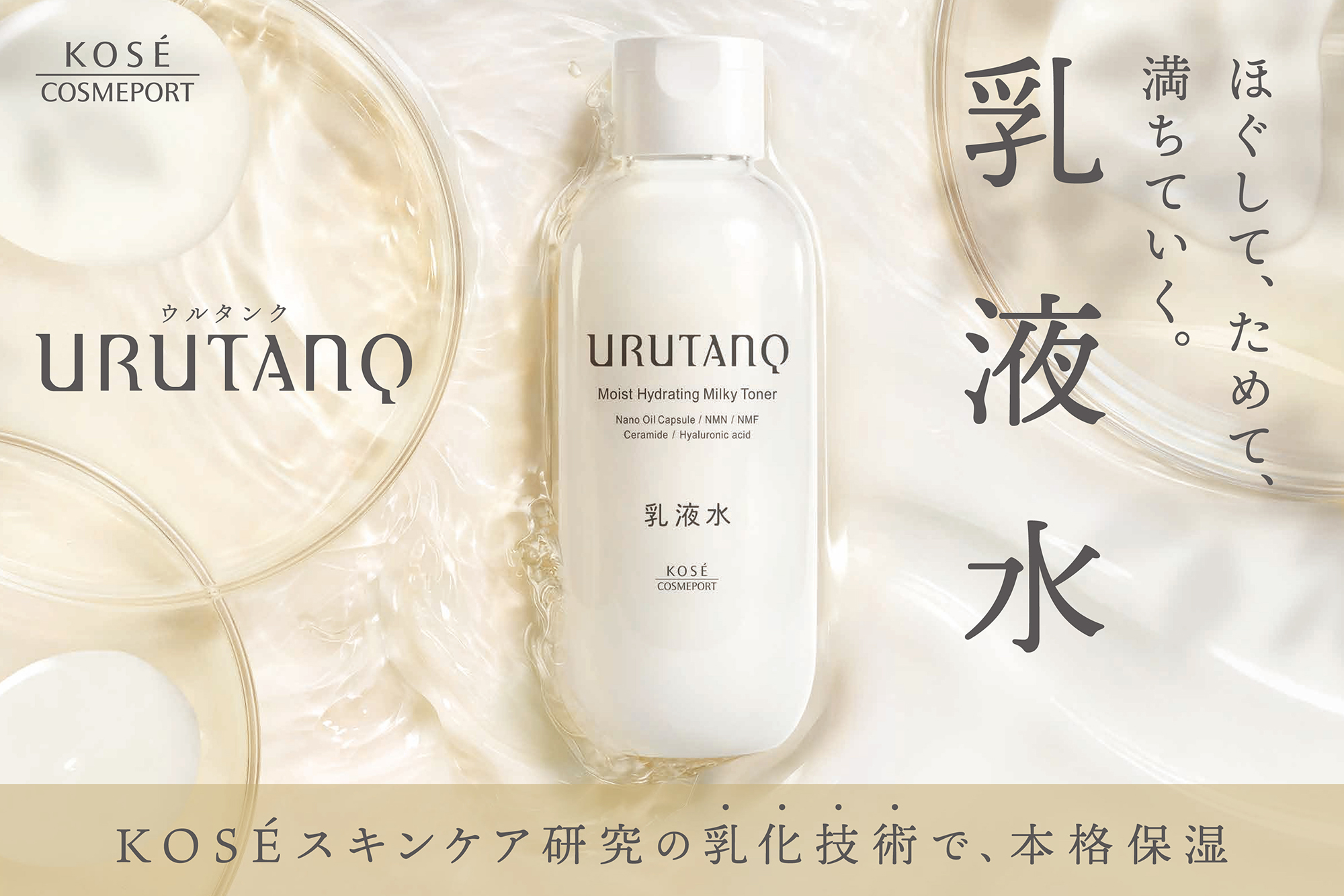
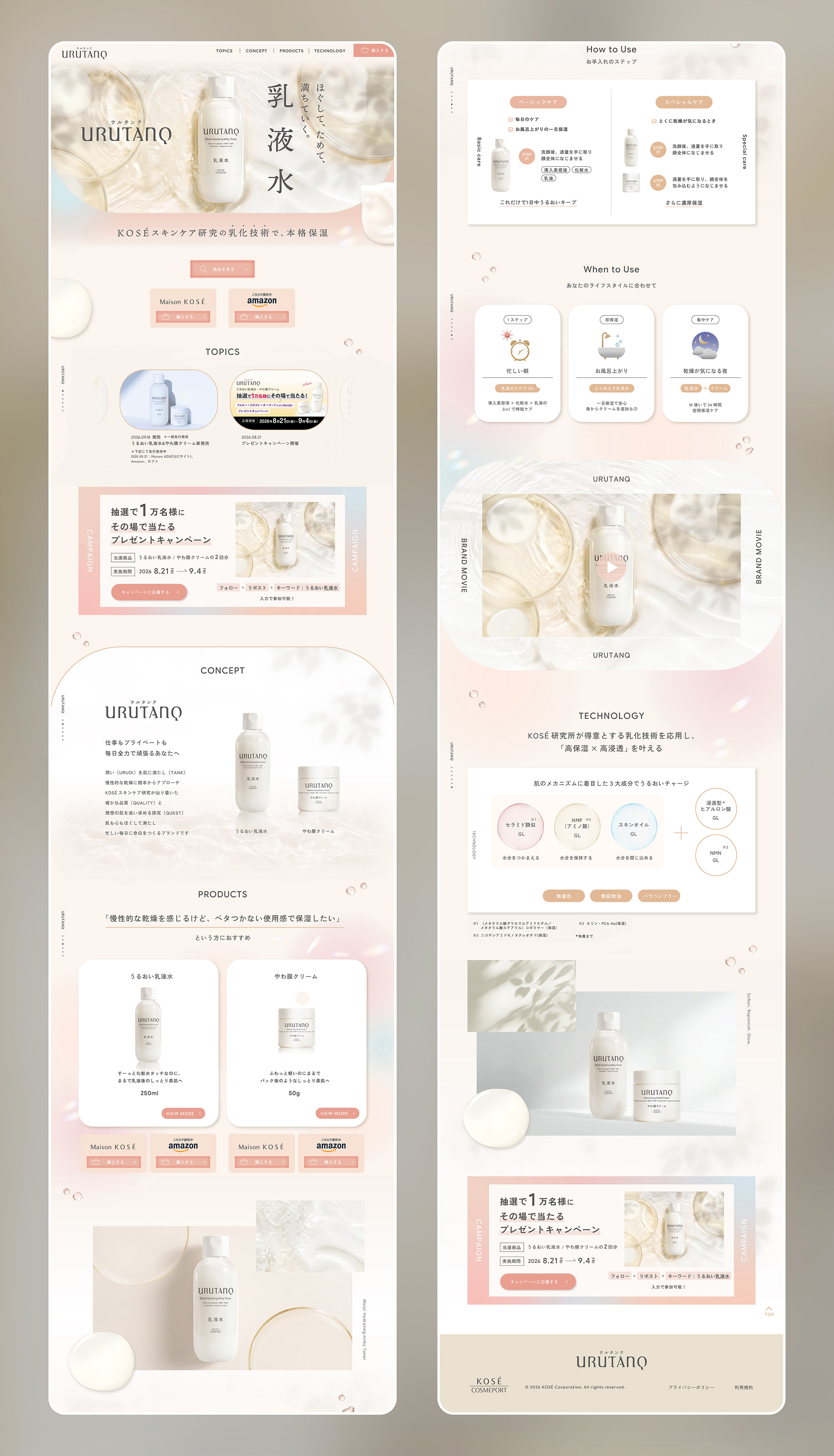
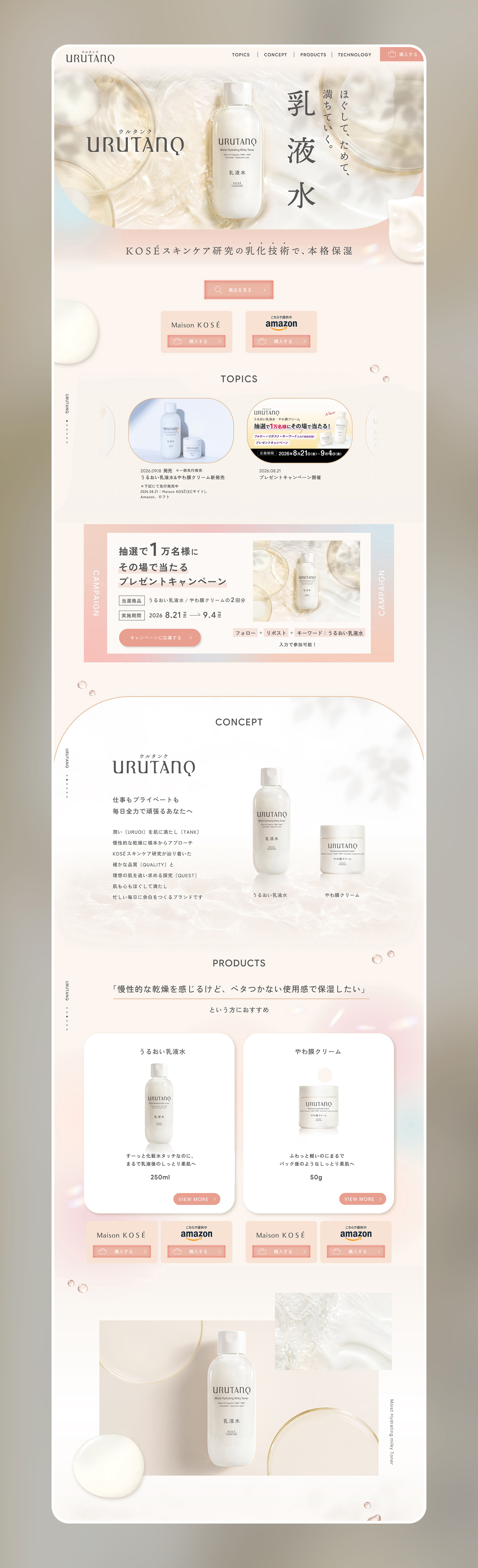
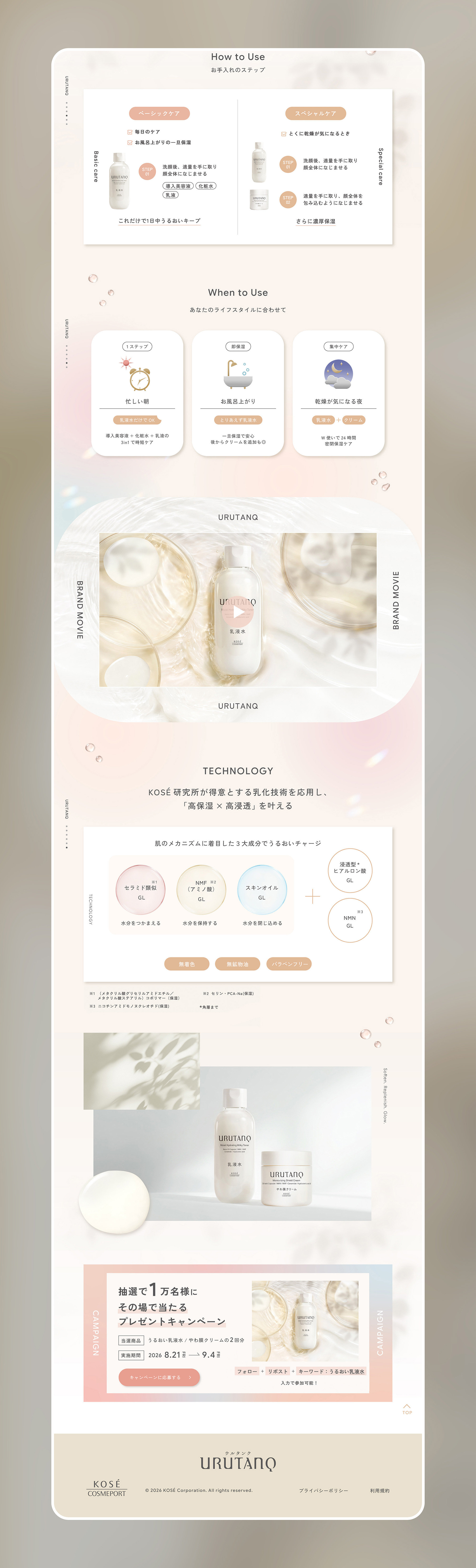
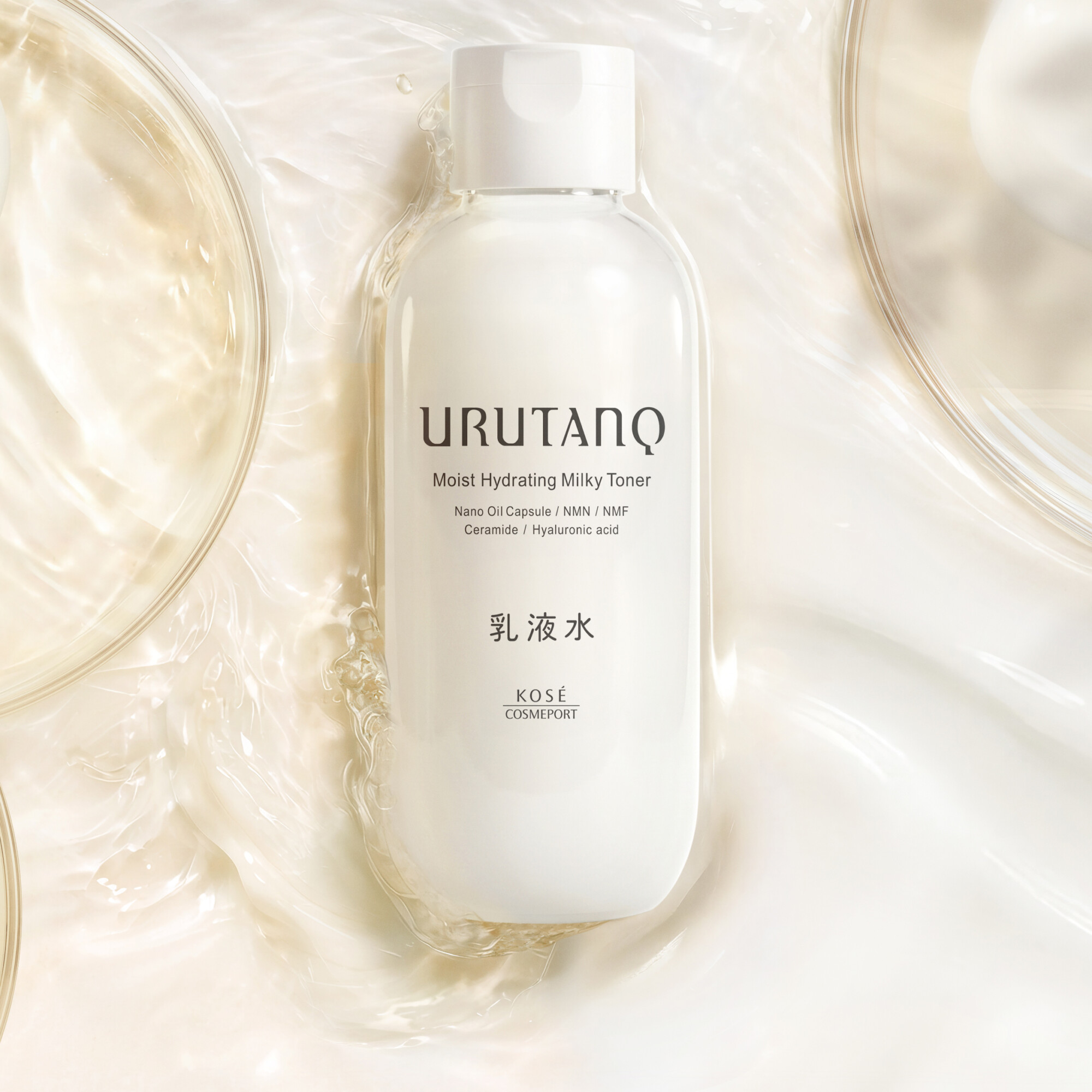
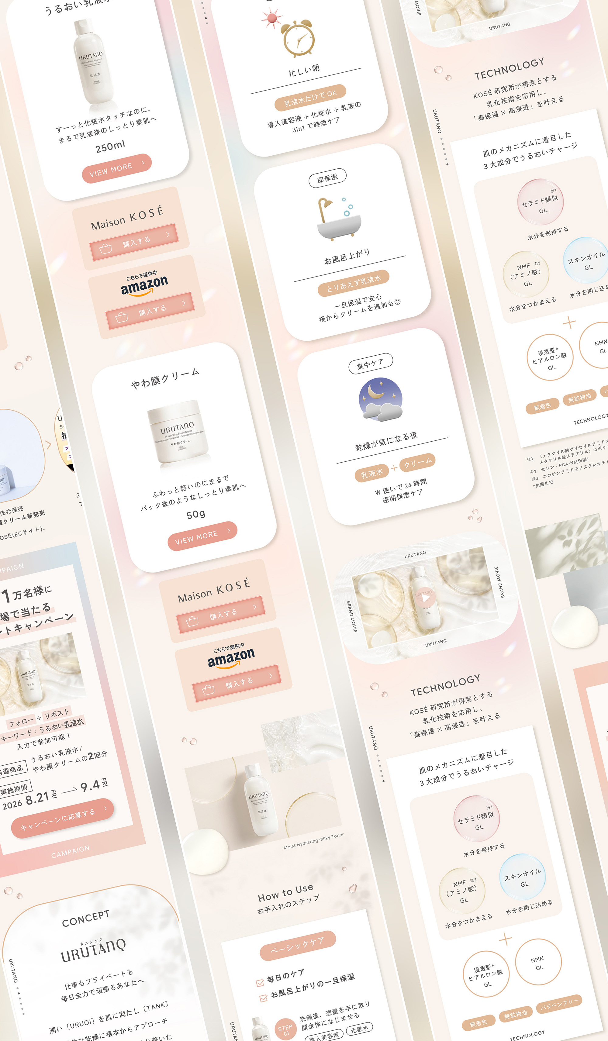
KOSĒ COSMEPORTより発売された乾燥肌をほぐして満たす貯水スキンケアブランド「ウルタンク(URUTANQ)」のキービジュアル、LPのアートディレクション、デザインをSMDOにて担当させていただきました。
肌も心もほぐして満たし忙しい毎日に余白をつくるブランドです。どうぞお試しください。
WEBサイト
SMDO was responsible for the art direction and design of the key visual and landing page for URUTANQ, a hydrating skincare brand for dry skin launched by KOSÉ.
Designed to soften and replenish both skin and mind, URUTANQ brings moments of calm and balance to busy everyday life. We invite you to experience it for yourself.
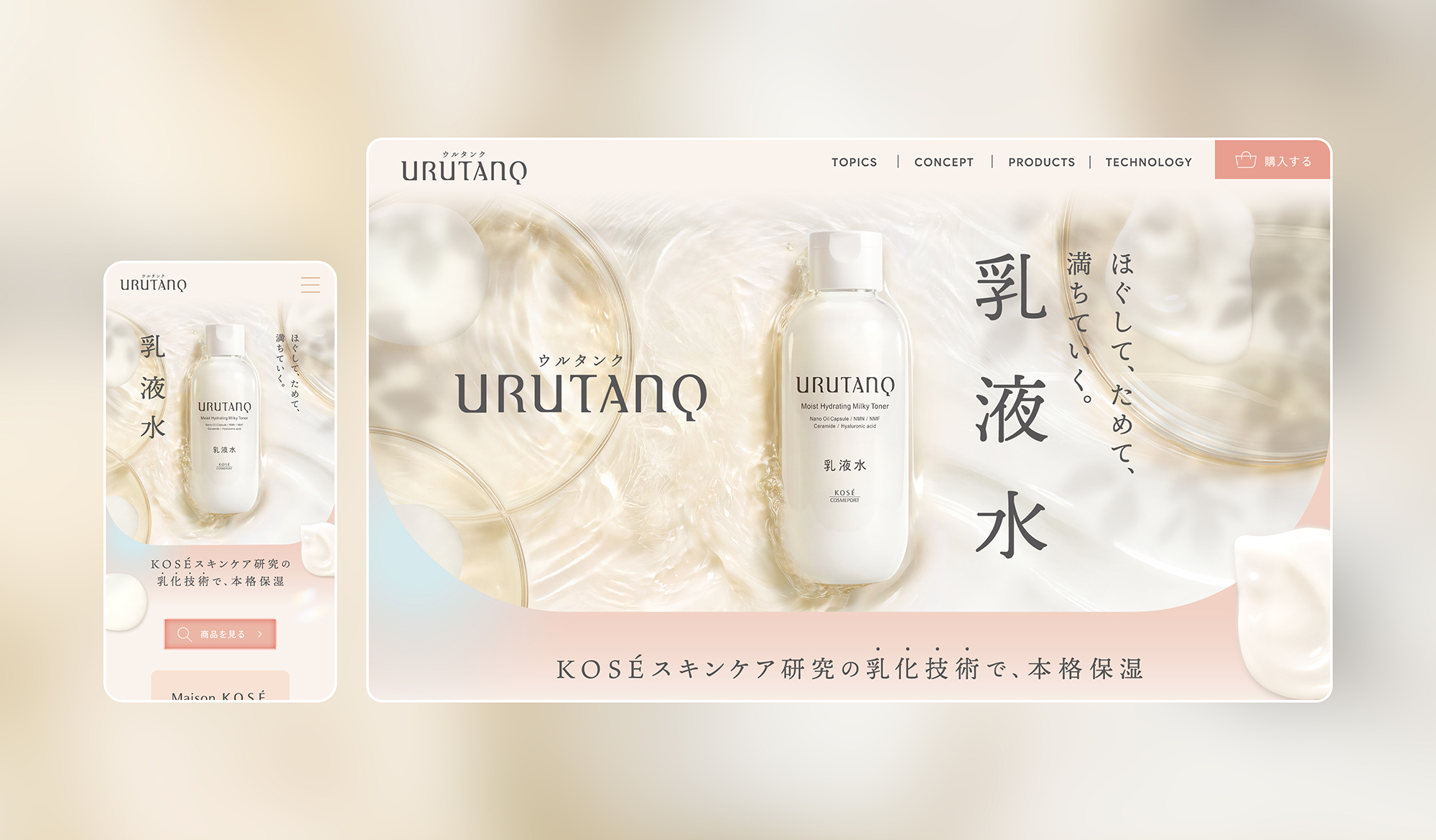
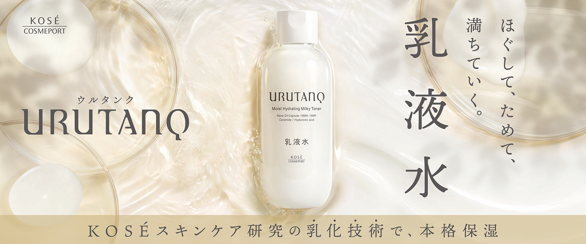
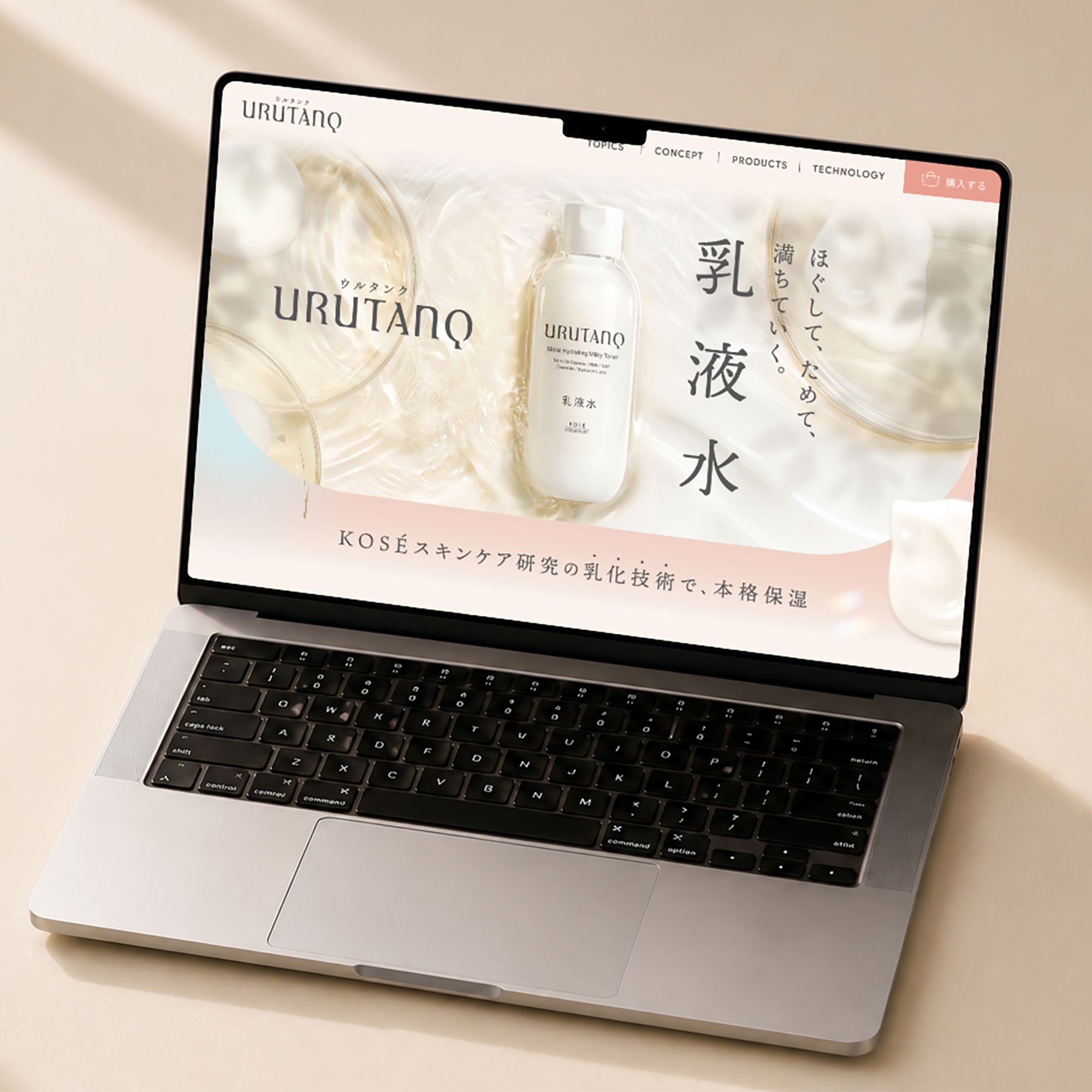
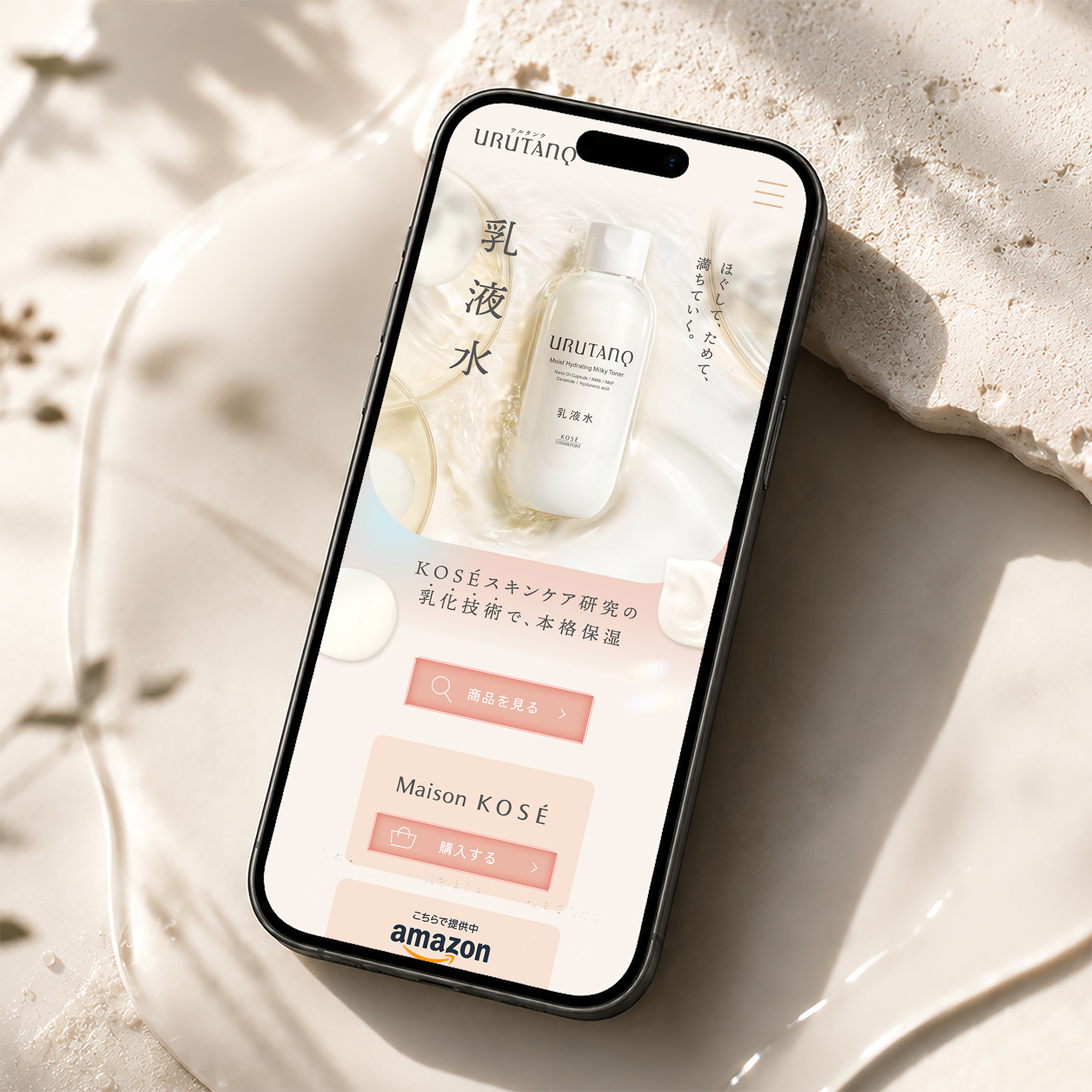
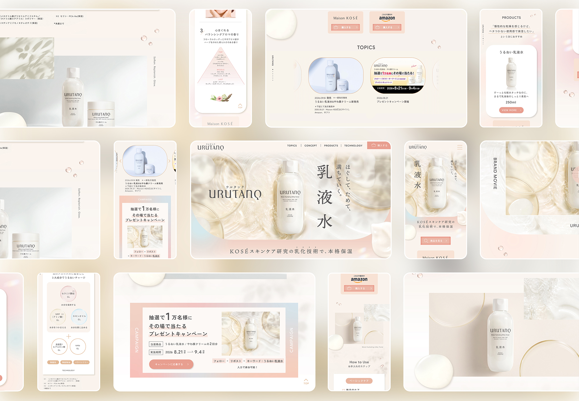
KV design
Art Direction : Minami Sano(SMDO)
Assistant Direction : Shinnosuke Nakasone(SMDO)
Chief Graphic Designer : Yuichi Ikehata(SMDO)
Graphic Designer:Yuko Onda(SMDO) , Maiko Shimohiro(SMDO)
LP design
Art Direction : Minami Sano(SMDO)
Assistant Direction : Shinnosuke Nakasone(SMDO)
Chief Graphic Designer : Yuichi Ikehata(SMDO)
Graphic Designer:Yuko Onda(SMDO)
Ilust: Matsurica(SMDO)
Web Coding:Hiroyuki Mizuide
Agency:Tribal Media House, Inc. (Modern Age)
Client:KOSÉ COSMEPORT
Tokyo University of Science ~ 150th Anniversary Website
東京理科大学150周年サイト
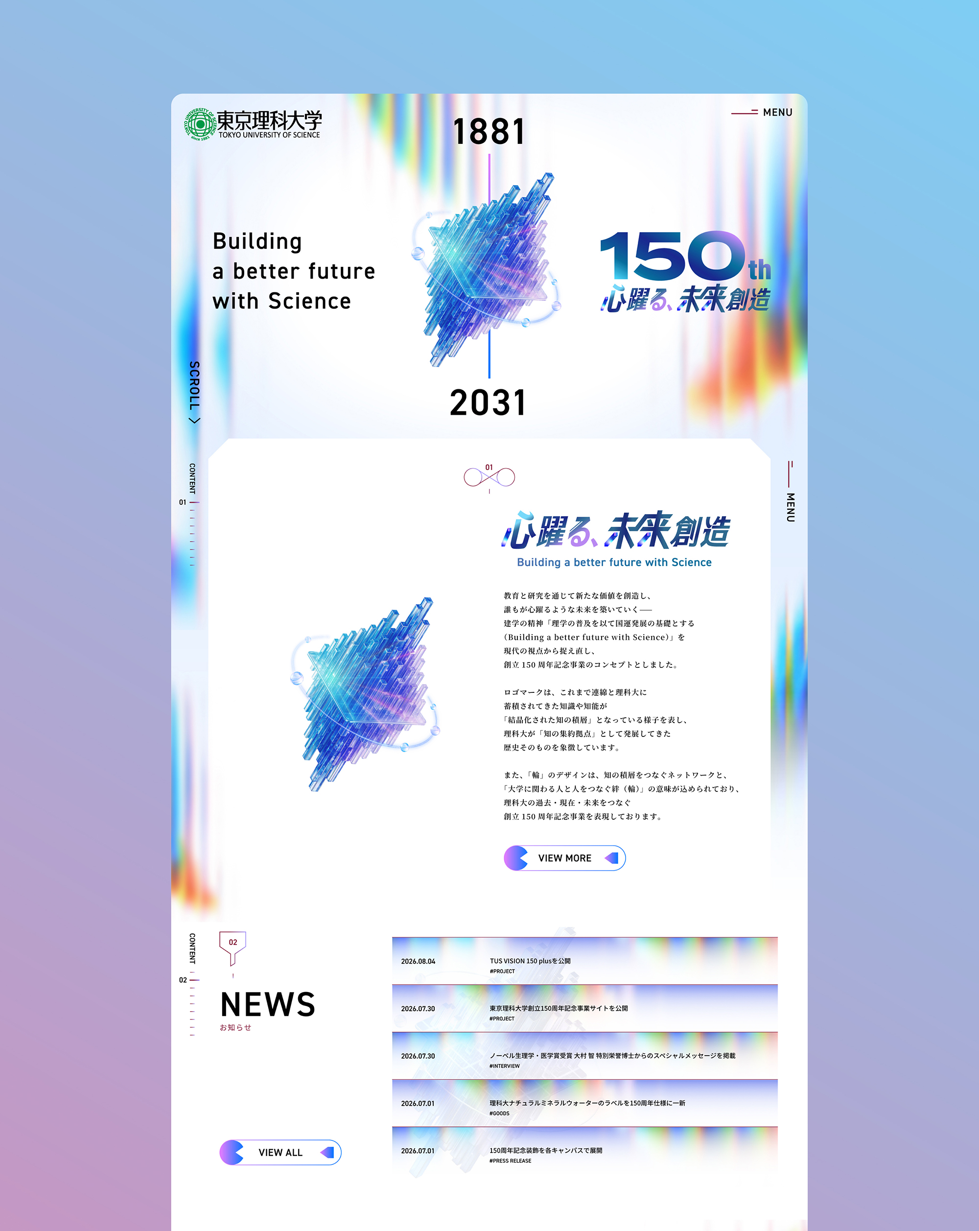
東京理科大学様からご依頼いただき、東京理科大学150周年サイトのWEBのアートディレクションとデザインをSMDOにて担当させていただきました。これまで連綿と理科大に蓄積されてきた知識や科学技術が「結晶化された知能の積層」となっている様子を表し、理科大が「知能の集約拠点」として発展してきた歴史そのものを象徴したシンボルを考案し、そのシンボルをメインに据えたWEBサイトを目指しました。
東京理科大学の卒業生でもあるアートディレクター・佐野自身の経験と大学への理解を生かし、理科大ならではのテクノロジーをふんだんに盛り込んだギミックを随所に取り入れ、母校を知るからこその視点で、「理科大らしさ」を随所に落とし込んでいます。
WEB以外にも150周年事業ロゴとキービジュアルのビジュアルコンセプトとロゴデザインの考案、アートディレクション、フラッグやペットボトルのラベルデザインなども担当させていただいております。
.
.
Beyond the website, SMDO was also responsible for developing the visual concept and logo design for the 150th Anniversary Project, as well as its overall art direction and various applications, including flags and bottled-water labels.
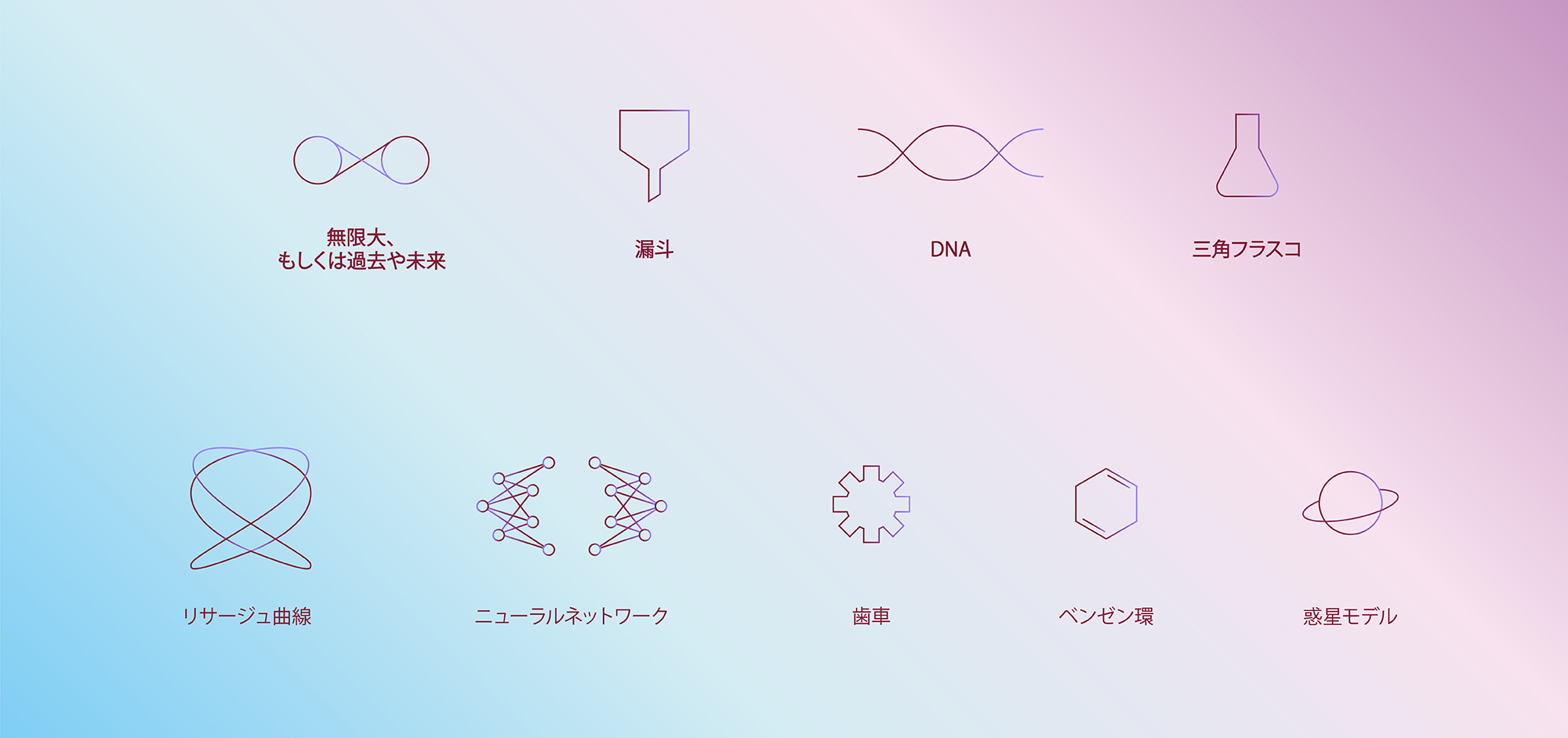
理系の要素を取り入れたアイコン一覧
A Collection of Icons Inspired by Science and Technology
酵素反応
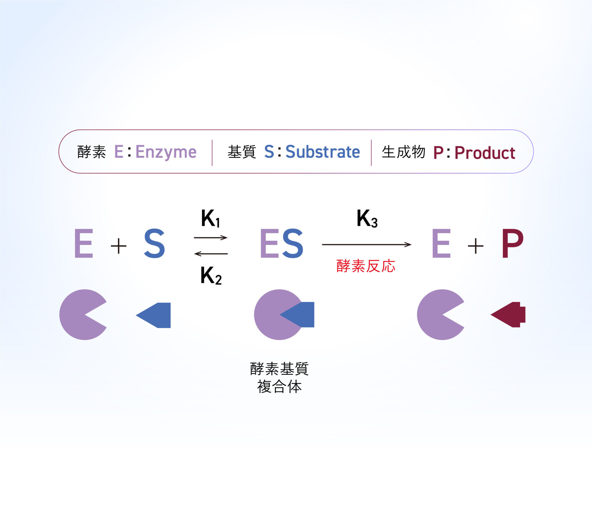
酵素と基質が結合する反応機構を、ボタンの動きに落とし込みました。 マウスオーバーすると、基質が酵素の“くぼみ”にぴたりとはまり、酵素–基質複合体を形成する様子を表現。科学的な仕組みを、直感的に楽しめるインタラクションへと展開しています。(左図:ミカエリス・メンテン式 / 右図:酵素反応をモチーフにしたボタンモーション)
Enzymatic Reaction
The mechanism by which an enzyme binds to a substrate is translated into the motion of a button. On mouseover, the substrate fits precisely into the enzyme’s “active site,” visually representing the formation of an enzyme–substrate complex. This scientific mechanism is transformed into an intuitive and engaging interactive experience.(Left: Michaelis–Menten Equation / Right: Button Motion Inspired by Enzymatic Reactions)

ニュートラルネットワーク
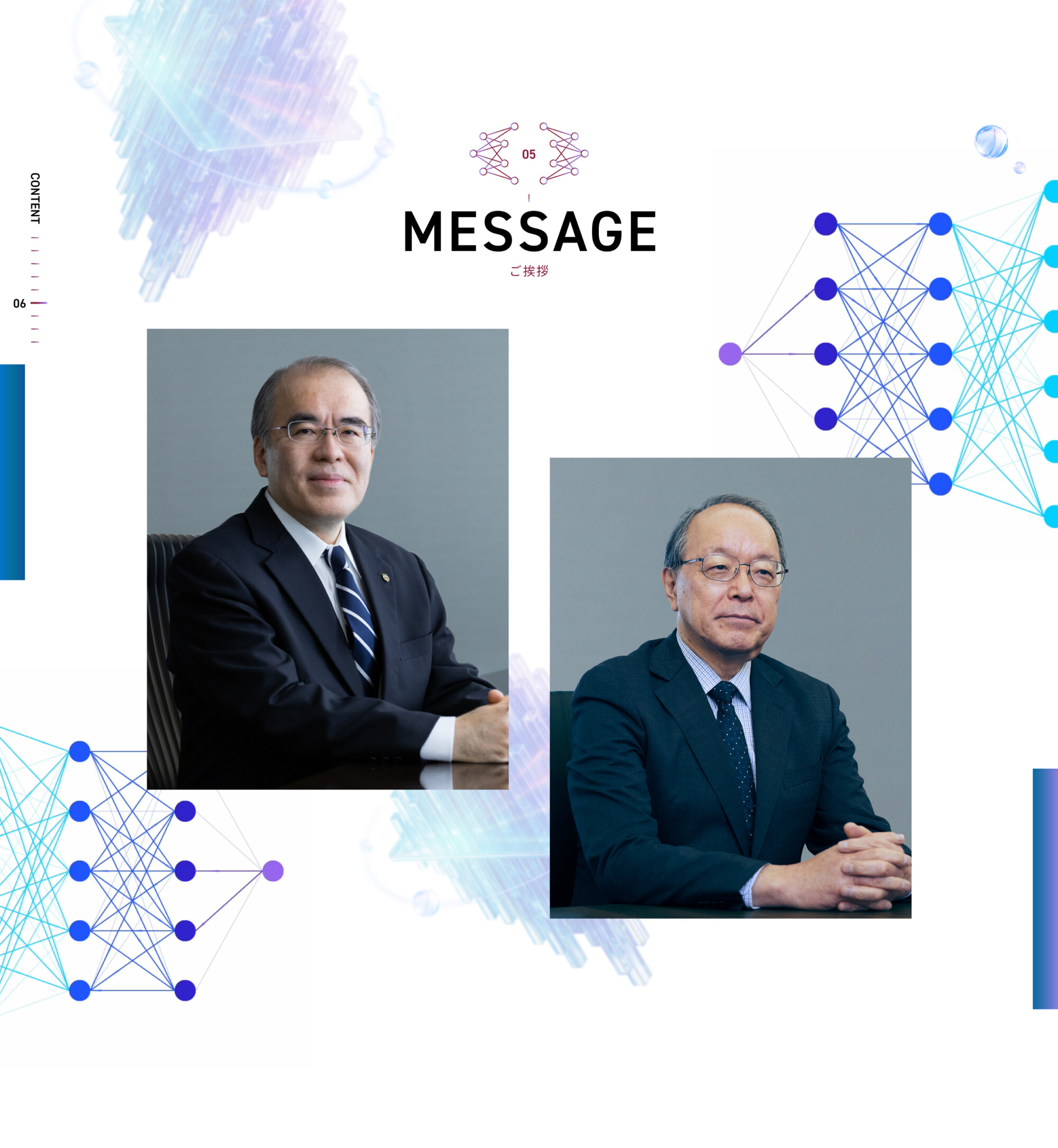
ニューラルネットワークを想起させる動的な背景表現により、 お二人のメッセージを情報が集約・分岐する「知のハブ」として際立たせる構成としています。
複数のノードが接続し、信号が行き交うイメージを重ねることで、個々の言葉が単なる挨拶文ではなく、 大学全体の知を束ね、次世代へと接続する中枢点であることを視覚的に示しています。
Neural Network
A dynamic background inspired by neural networks positions the messages from the two leaders as a “hub of knowledge,” where information converges and branches out.By layering imagery of interconnected nodes and signals flowing between them, the design presents their words not simply as greetings, but as a central point that brings together the university’s collective knowledge and connects it to the next generation.
一般相対性理論
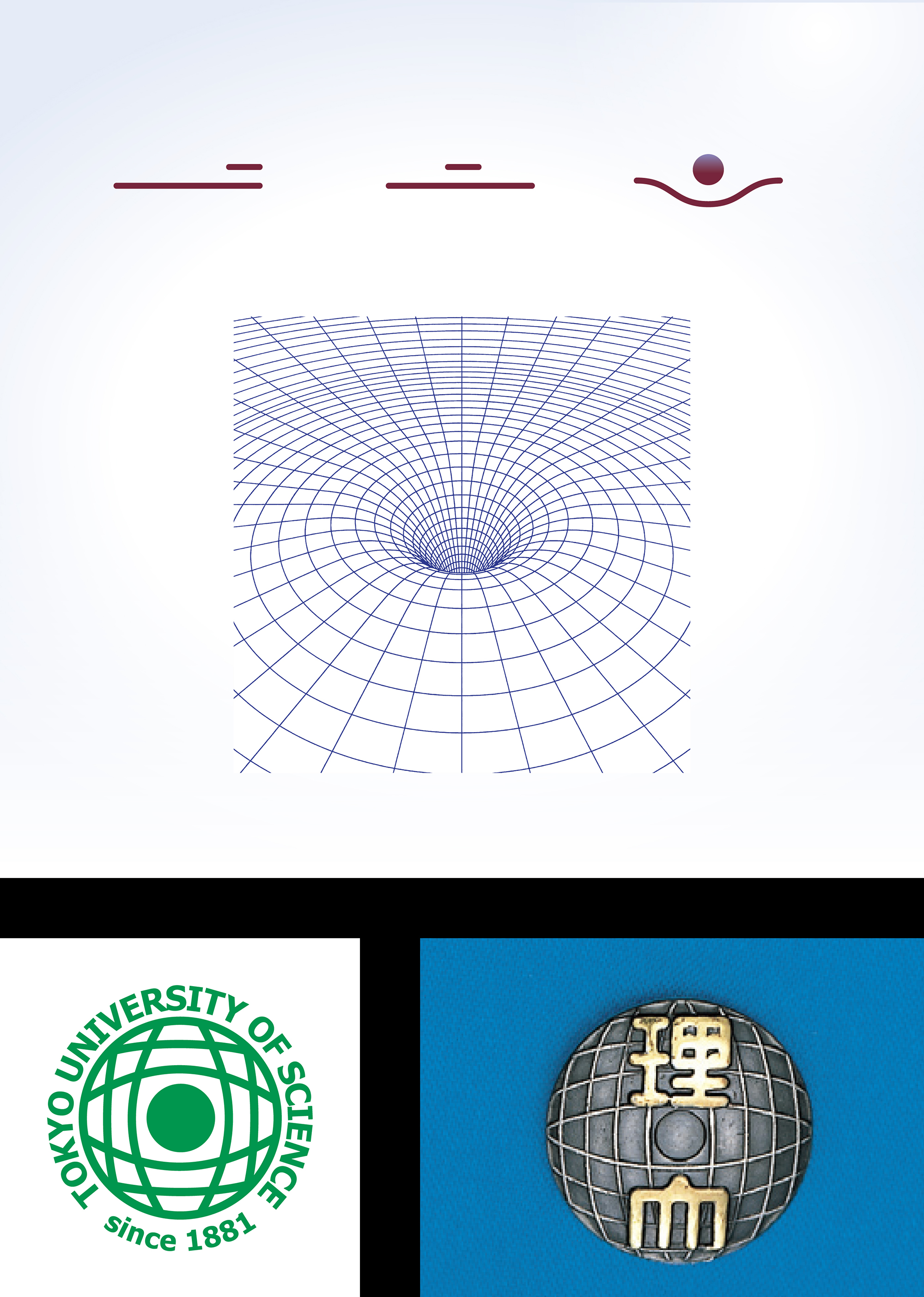
東京理科大学の徽章は、アインシュタインによって確立された一般相対性理論を図案化したもので、太陽の重力によって曲げられる光の軌道を模式的に描いています。その徽章のモチーフから着想し、質量によって時空が歪むという考え方を、線と球によるシンプルな形と動きで視覚化しました。(左図:一般相対性理論をモチーフにしたメニューボタン / 右図:一般相対性理論の概念イメージ)
General Relativity
The emblem of Tokyo University of Science is based on a visualization of Einstein’s theory of general relativity, schematically depicting the path of light bent by the Sun’s gravity. Inspired by this motif, we visualized the concept of mass curving spacetime through simple forms and motion using lines and spheres.(Left: Menu Button Inspired by General Relativity / Right: Conceptual Visualization of General Relativity)
エントロピー
エントロピーの変化を可視化する動きを採用し、秩序から無秩序へと移行する状態変化を直感的に体験できる設計としています。 整理された低エントロピー状態から、操作を契機に要素が拡散する高エントロピー状態へと遷移させることで、抽象的な概念を視覚的に表現しました。
「状態」と「変化」をUIに落とし込むことで、理科大らしい知的なギミックと遊び心を両立させたデザインです。
Entropy
We adopted motion that visualizes changes in entropy, creating an intuitive experience of the transition from order to disorder. By shifting from an organized, low-entropy state to a dispersed, high-entropy state triggered by user interaction, the design gives visual form to an otherwise abstract concept.
By translating the ideas of “state” and “change” into the UI, the design combines an intellectually engaging mechanism inspired by the scientific spirit of Tokyo University of Science with a sense of playfulness.

クロマトグラフィー
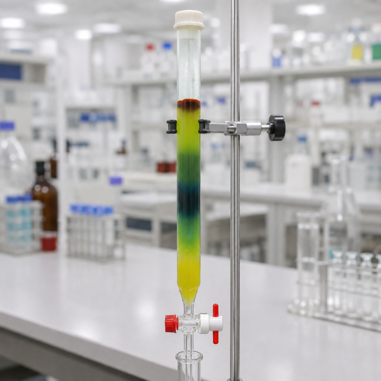
クロマトグラフィーを想起させるアニメーションで、分析や実験のプロセスを動きと色彩の両面から表現しています。 理系らしい知性と実験性を感じさせるデザインです。

Chromatography
An animation inspired by chromatography expresses the process of analysis and experimentation through both movement and color. The design conveys a sense of scientific intelligence and experimentation, reflecting the distinctive character of Tokyo University of Science.
目盛り
目盛りを想起させる目盛りをモチーフに、情報の蓄積を視覚的に表現。スクロールに合わせて目盛りやグラデーションが変化し、知識が積み重なっていく感覚を演出しています。
理系らしいモチーフを、遊び心のあるUIへと落とし込みました。
Scale
Using scale markings as a motif, the design visually represents the accumulation of information. As users scroll, the markings and gradients shift, creating a sense of knowledge gradually building up.
Scientific elements are reinterpreted through a playful and engaging UI.
FVを構成するモーション
背景に浮かぶフレアには、光や波の「ゆらぎ」をイメージした動きを取り入れています。淡い光が上下にゆっくりと揺らめくことで、静止した空間の中にも絶えず変化するエネルギーの存在を表現しています。
シンボル以外の要素が動きを持ってふわっと現れた後、「結晶化された知能の積層」を表すシンボルが挙動を始めます。蓄積されてきた知識や科学技術を結晶の重なりに、それらをつなぐネットワークや人との絆を「輪」に見立て、知が集積し、相互につながることで新たな知へと発展していく姿を、動きとして表現しています。
Motion Elements of the FV
The flares in the background incorporate a gentle motion inspired by the subtle fluctuations of light and waves. Their soft, slow movement evokes a sense of energy that is constantly shifting, even within an otherwise still space.
After the surrounding elements softly emerge into view, the symbol representing “layers of crystallized intelligence” comes to life. The overlapping crystals represent accumulated knowledge and scientific technologies, while the rings symbolize the networks and human connections that link them together. Through motion, the symbol expresses how knowledge accumulates, connects, and evolves into new forms of intelligence.
サイト全体の構成 / デザイン
Overall Site Structure / Design
WEB design
Art Direction : Minami Sano(SMDO)
Assistant Direction : Shinnosuke Nakasone(SMDO)
Chief Graphic Designer : Yuichi Ikehata(SMDO)
Graphic Designer:Yuichi Ikehata(SMDO) , Sachiko Fukuoka(SMDO) , Romi Nakano(SMDO)
AssistantDesigner:Mariko Adachi(SMDO) , Machiko Terada(SMDO) , Anju Mori(SMDO)
Web Coding:CIN GROUP Inc , 株式会社HAMONI
cliant : Tokyo University of Science
東京理科大学 担当事例
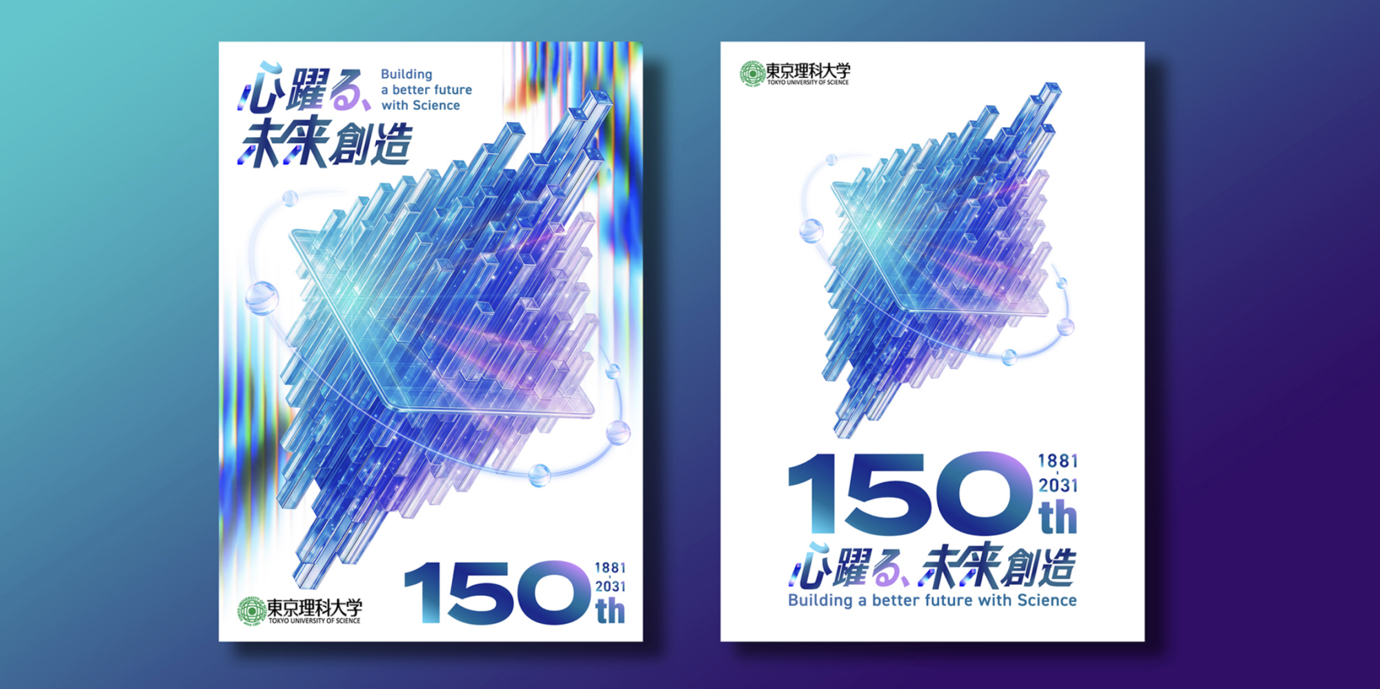
150周年事業ロゴとキービジュアルのビジュアルコンセプトとロゴデザインの考案、アートディレクション、デザインをSMDOにて担当させていただきました。また制作グッズとしてポスター(2種類)、クリアファイルのアートディレクションとデザインも担当させていただきました。
.
Tokyo University of Science ~ Flag & Sign
フラッグ、看板のアートディレクションとデザインを担当させていただきました。。現在、野田キャンパスと葛飾キャンパスに掲載されております。
Tokyo University of Science ~ Plastic Bottle Label
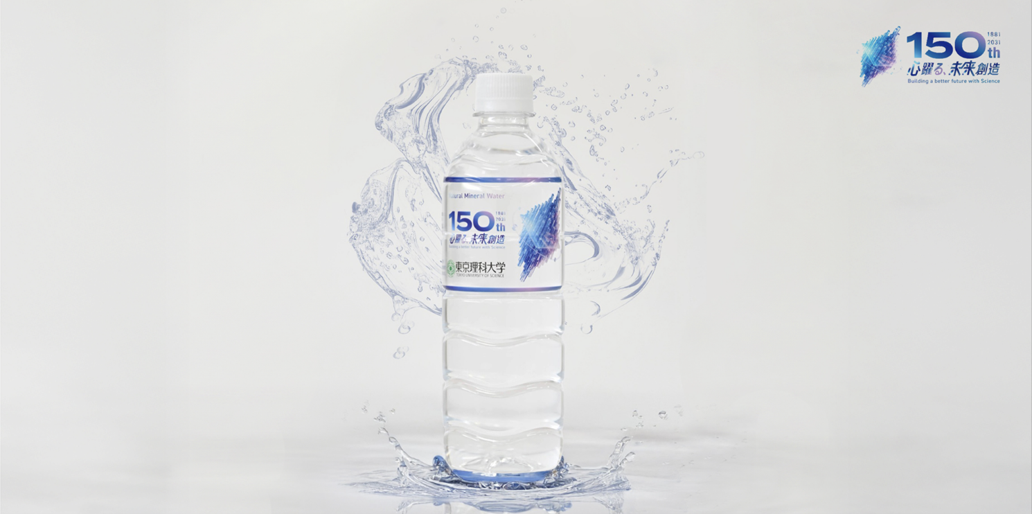
「東京理科大学 ナチュラルミネラルウォーター」のラベルのアートディレクションとデザインも担当しております。キャンパスの販売店(生協等)、自動販売機で販売中。
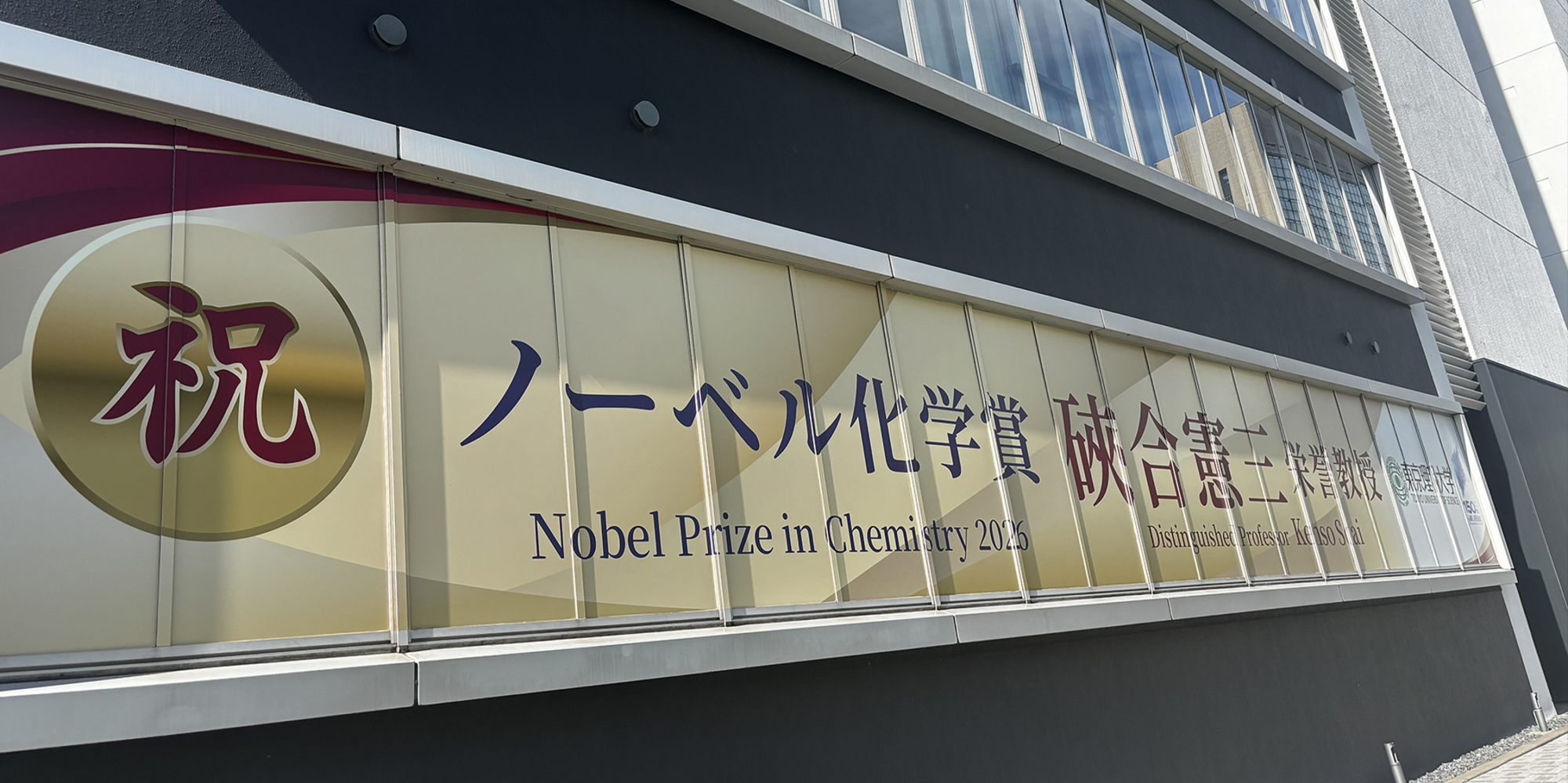
Tokyo University of Science ~ Nobel Prize Celebration Banner
佐野の母校でもある東京理科大学よりご依頼いただき、2026年ノーベル化学賞受賞を祝う記念横断幕のアートディレクションおよびデザインをSMDOにて担当しました。
Tokyo University of Science ~Interview
東京理科大学150周年サイトのWEBデザインを担当しました。
サイト内のインタビュー企画では、卒業生や教職員、学生それぞれの視点から、東京理科大学で培われてきた経験や学び、そしてこれからの未来について紹介しています。
Tokyo University of Science ~ RIDAIHITO
佐野の母校である東京理科大学様から取材のご依頼をいただき、東京理科大学報 第237号に掲載される「理大人」のコーナーでインタビューが公開れております。
Tokyo University of Science ~Interview
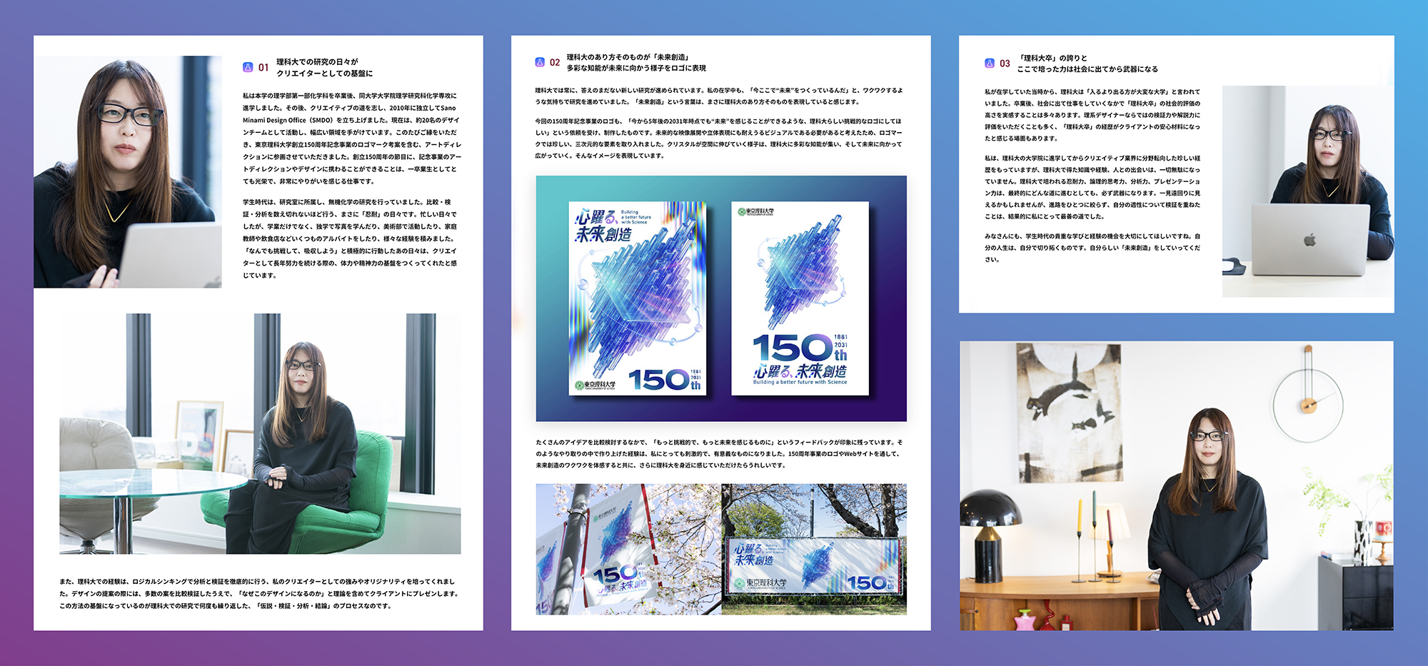
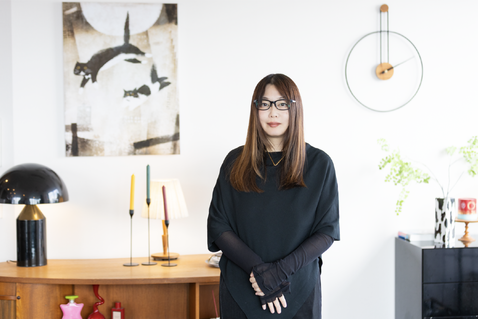
SMDO代表の佐野も東京理科大学の卒業生であり、インタビューに登場。理科大での研究経験が現在のクリエイティブの基盤となっていることや、卒業生として150周年記念事業のアートディレクション・デザインに携わる想い、150周年ロゴに込めた「未来創造」について語っています。
WEBデザインでは、人物それぞれの言葉や表情を丁寧に伝えながら、150周年サイト全体の世界観と連動したインタビューコンテンツを目指しました。
SMDO representative Sano, an alumnus of Tokyo University of Science, is also featured in the series. In the interview, she discusses how her research experience at the university has shaped the foundation of her creative practice, her thoughts on contributing to the 150th anniversary project through art direction and design as an alumna, and the concept of “Creating the Future” embodied in the anniversary logo.
For the web design, we aimed to create an interview experience that carefully conveys each person’s words and expressions while remaining visually connected to the overall identity of the 150th anniversary website.

Sano Minami Design Office CEO/アートディレクター
(2006年 東京理科大学 理学部第一部 化学科卒業)
佐野 みなみ
1983年11月03日生まれ。東京理科大学理学部化学科卒業 東京理科大学大学院理学研究科 化学専攻中退
その後、第一種特待生としてバンタンデザイン研究所グラフィックデザイン学科入学。
C.T.T.P (現 信藤三雄事務所) インターン在籍後2009年4月より2010年4月まで 合同会社OPERA (現 株式会社ヴィーナス・スプリング ) に在籍。グラフィックデザイナーとして勤務。
2010年4月より独立しSano Minami Design Officeを設立。
2023年から3年連続でグラフィックデザイン年鑑『MdNデザイナーズファイル』にて最前線で活躍しているトップクリエイター&次世代を担う若手デザイナー255組の1人として掲載されている。
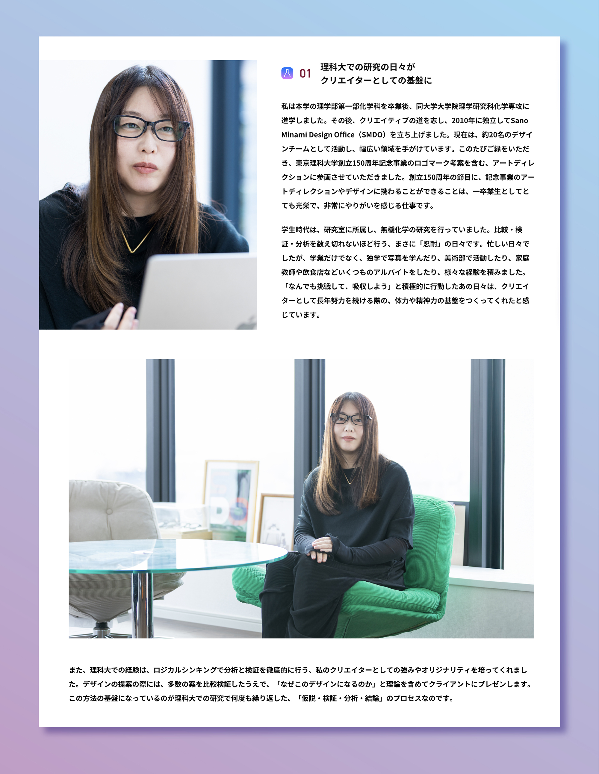
続きは是非東京理科大学150周年サイトのインタビューページにてご覧ください。
東京理科大学150周年サイト
佐野みなみインタビューページ
東京理科大学 担当事例
150周年事業ロゴとキービジュアルのビジュアルコンセプトとロゴデザインの考案、アートディレクション、デザインをSMDOにて担当させていただきました。また制作グッズとしてポスター(2種類)、クリアファイルのアートディレクションとデザインも担当させていただきました。
.
Tokyo University of Science ~ 150th Anniversary Website
東京理科大学150周年サイトのWEBデザインも担当しております。理科大ならではのギミックや遊び心を随所に取り入れ、150年の歴史とこれからの未来を感じられるWEBサイトを目指しました。
Tokyo University of Science ~ Flag & Sign
フラッグ、看板のアートディレクションとデザインを担当させていただきました。。現在、野田キャンパスと葛飾キャンパスに掲載されております。
Tokyo University of Science ~ Plastic Bottle Label
「東京理科大学 ナチュラルミネラルウォーター」のラベルのアートディレクションとデザインも担当しております。キャンパスの販売店(生協等)、自動販売機で販売中。
Tokyo University of Science ~ Nobel Prize Celebration Banner
佐野の母校でもある東京理科大学よりご依頼いただき、2026年ノーベル化学賞受賞を祝う記念横断幕のアートディレクションおよびデザインをSMDOにて担当しました。
Tokyo University of Science ~ RIDAIHITO
佐野の母校である東京理科大学様から取材のご依頼をいただき、東京理科大学報 第237号に掲載される「理大人」のコーナーでインタビューが公開れております。
Fujikoshi Rebranding vol.2


ジュエリーブランド「Fujikoshi」のKV第2弾が公開されています。
前回に引き続き
・クリエイティブディレクション
・アートディレクション
・グラフィックデザイン
・キービジュアル等の撮影全般
・撮影ディレクションと撮影チームのキャスティング
・全体の進行管理
・スチールレタッチ(人物はカメラマン竹下さんと共同レタッチ)
・モデルキャスティング
などクリエイティブ全般をSMDOが担当させていただきました。
ECサイト
https://fujikoshijewelrystore.com/
https://www.instagram.com/fujikoshi_jewelry/
Fujikoshi Rebranding vol.1はこちら
SMDO was responsible for the overall creative direction for the second key visual campaign of the jewelry brand Fujikoshi.
Our scope included:
• Creative Direction
• Art Direction
• Graphic Design
• Photography for the key visual and other campaign assets
• Photography Direction and Casting of the Photography Team
• Overall Project Management
• Still Image Retouching (portrait retouching in collaboration with photographer Takeshita)
• Model Casting
From concept development through photography and design, SMDO was involved in every stage of the creative process to bring the brand’s vision to life.


KV Design
Art Direction & PhotoDirection : Minami Sano(SMDO)Assistant Direction : Shinnosuke Nakasone(SMDO) , Machiko Terada(SMDO)
Chief Graphic Designer : Yuichi Ikehata(SMDO)
Graphic Designer : Machiko Terada(SMDO)
Photoshoot &Video ShootArt Direction & PhotoDirection : Minami Sano(SMDO)Assistant Direction : Shinnosuke Nakasone(SMDO) , Machiko Terada(SMDO)Photographer&Videographer: Takuma Iioka
Photographer Assistant:Shaikh SofianFashion Stylist : Kumiko Yashiro(Y’s C)Fashion Stylist Assistant: Anna IikuraHair & Makeup:Rika Tsutsui
Hair & Makeup Assistant:Kana TakahashiModel : HINO (STANFORD) , 優里(INFINITY)Body Parts Model:Machiko Terada(SMDO)
Client:株式会社富士越


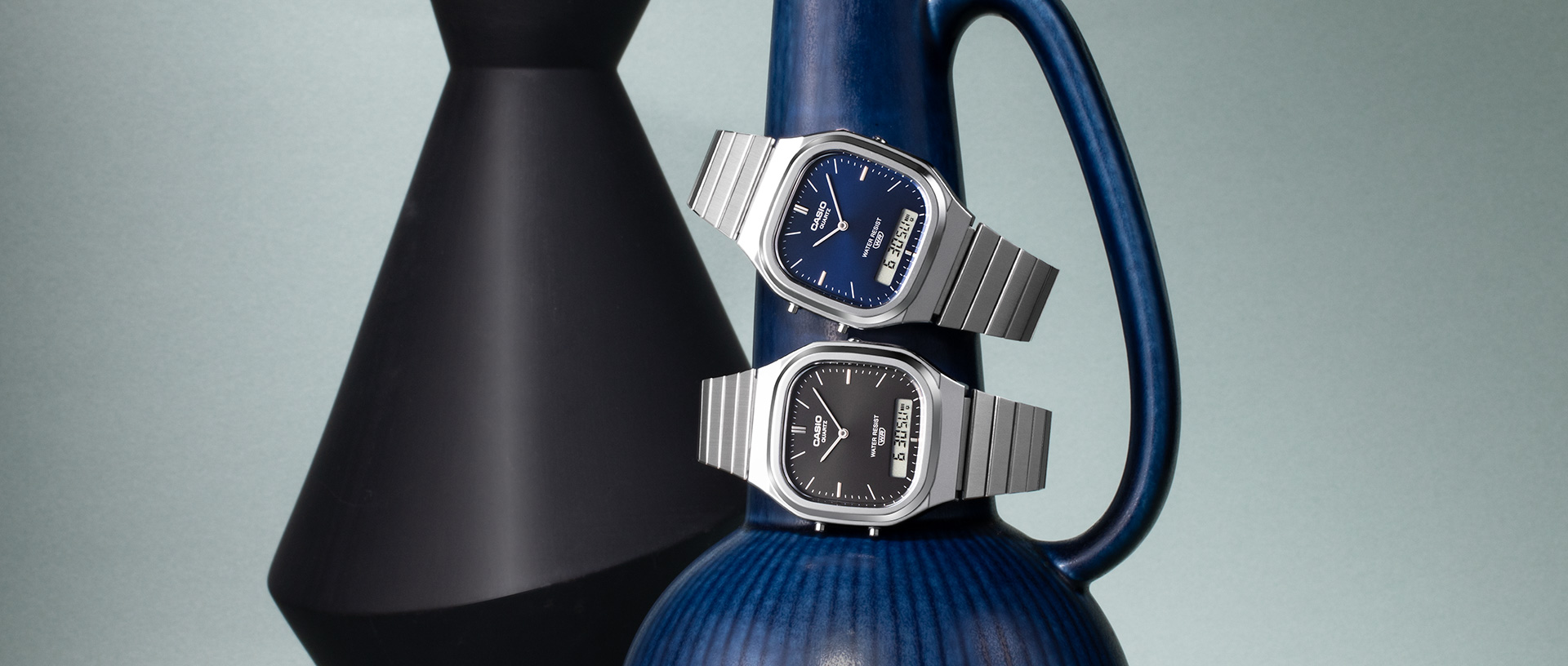
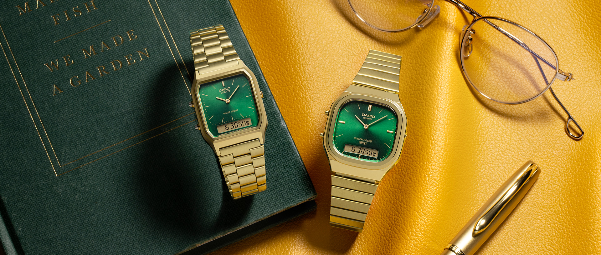
CASIO VINTAGE KV
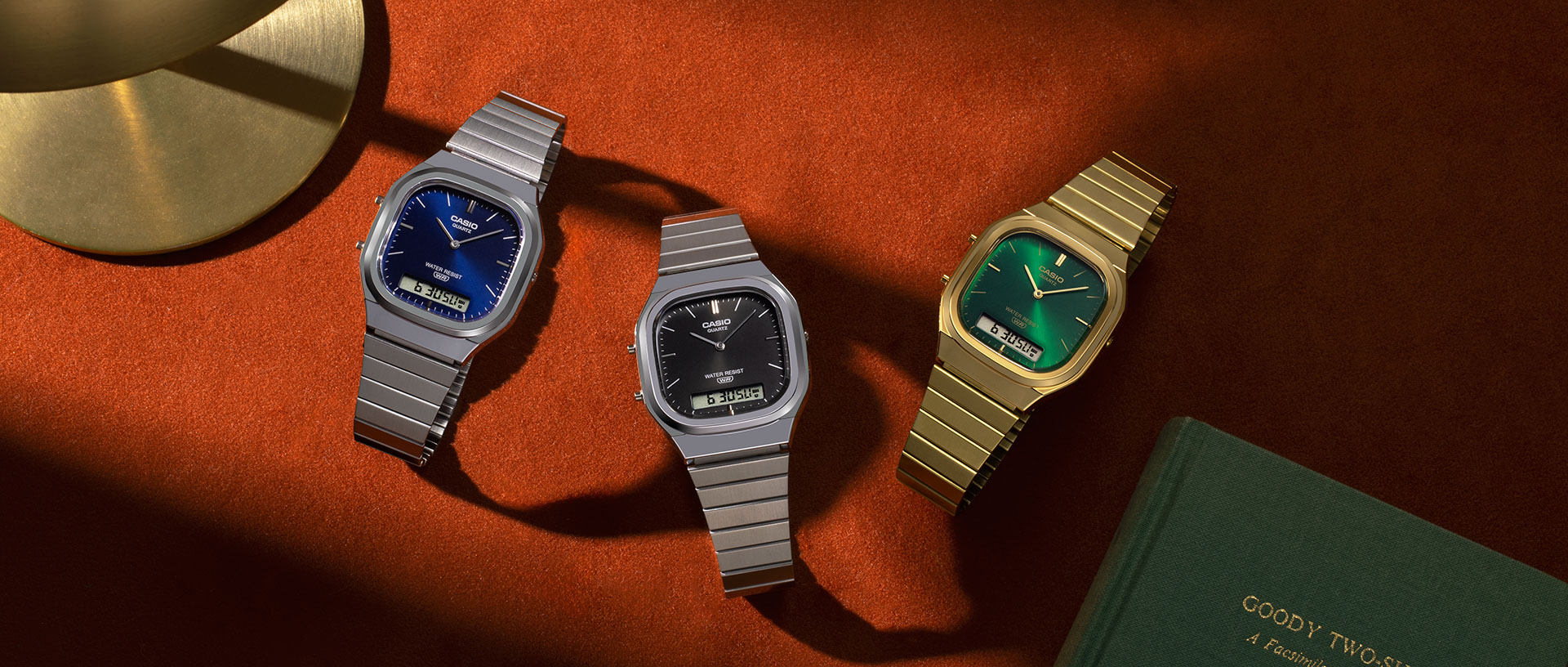
CASIO VINTAGEのKVにおけるアートディレクションとスタイリスト手配をSMDOで担当しました。国内でも予約販売でリリースされております。
グローバル
https://www.casio.com/intl/watches/casio/vintage/
国内
https://www.casio.com/jp/watches/casio/casio-classic/
Photo Direction & Stylist Coordination : Minami Sano(SMDO)Assistant Direction : Shinnosuke Nakasone(SMDO)
Prop Stylist:Honoka Fukano
Agency:グラード株式会社
Client:カシオ計算機株式会社
SMDO was responsible for the art direction and photography for the key visual of CASIO VINTAGE. The product is also available for pre-order in Japan.
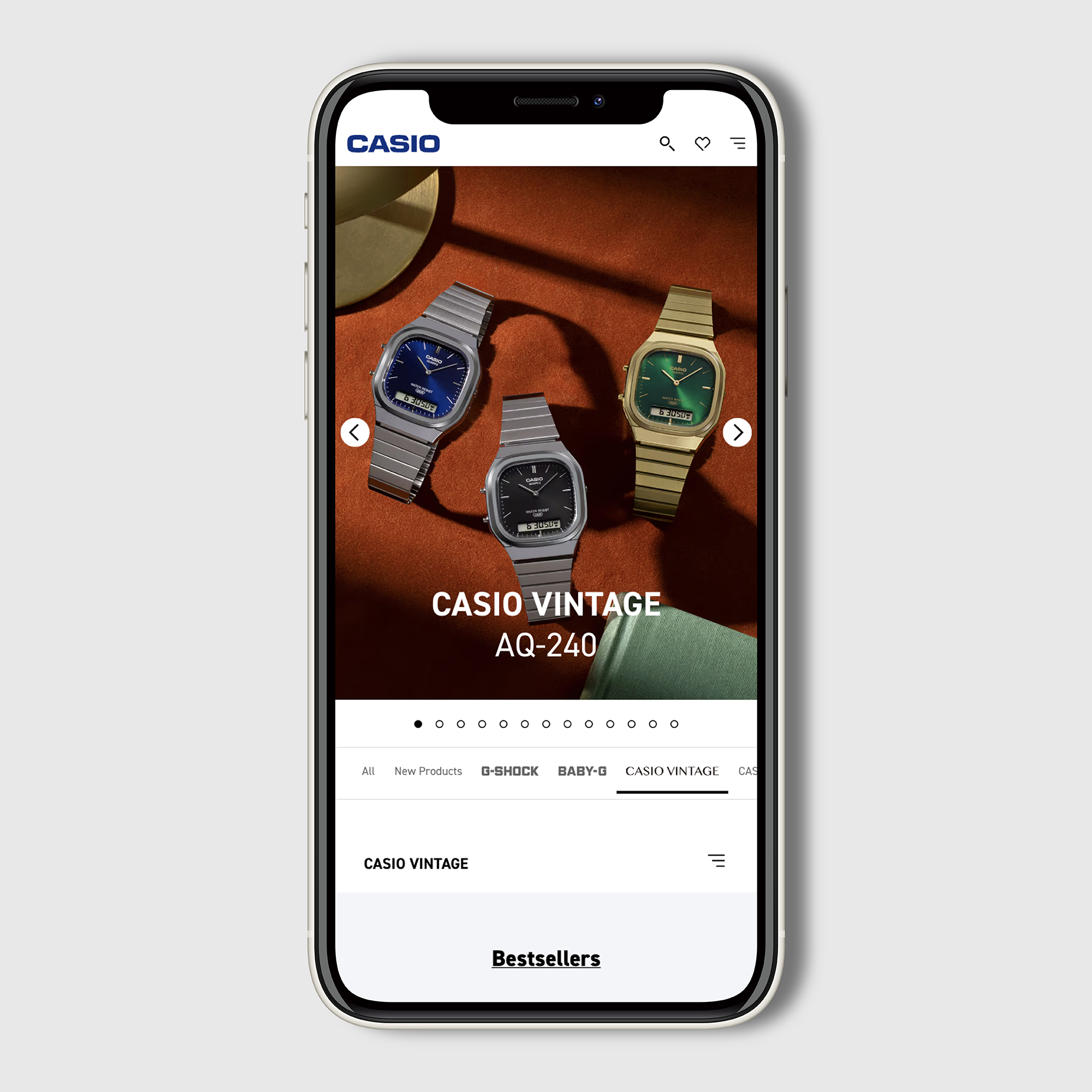
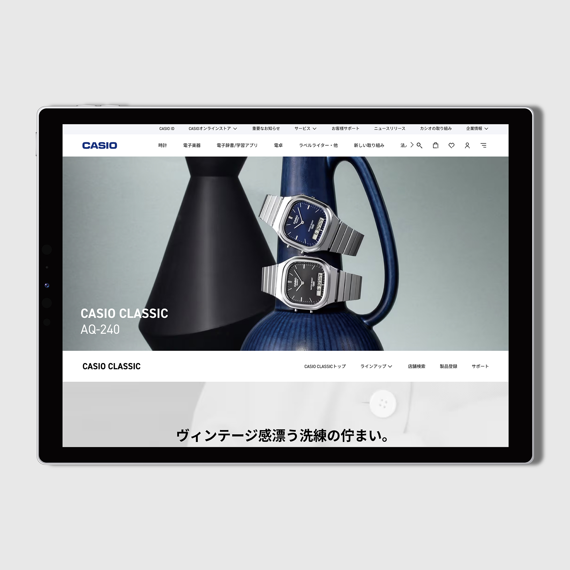
※WEBデザインはSMDOでの作成ではありません。
Tokyo University of Science ~ Plastic Bottle Label


佐野の母校でもある東京理科大学様からご依頼いただき、150周年事業ロゴとキービジュアルのビジュアルコンセプトとロゴデザインの考案、アートディレクション、デザインをSMDOにて担当させていただきました。
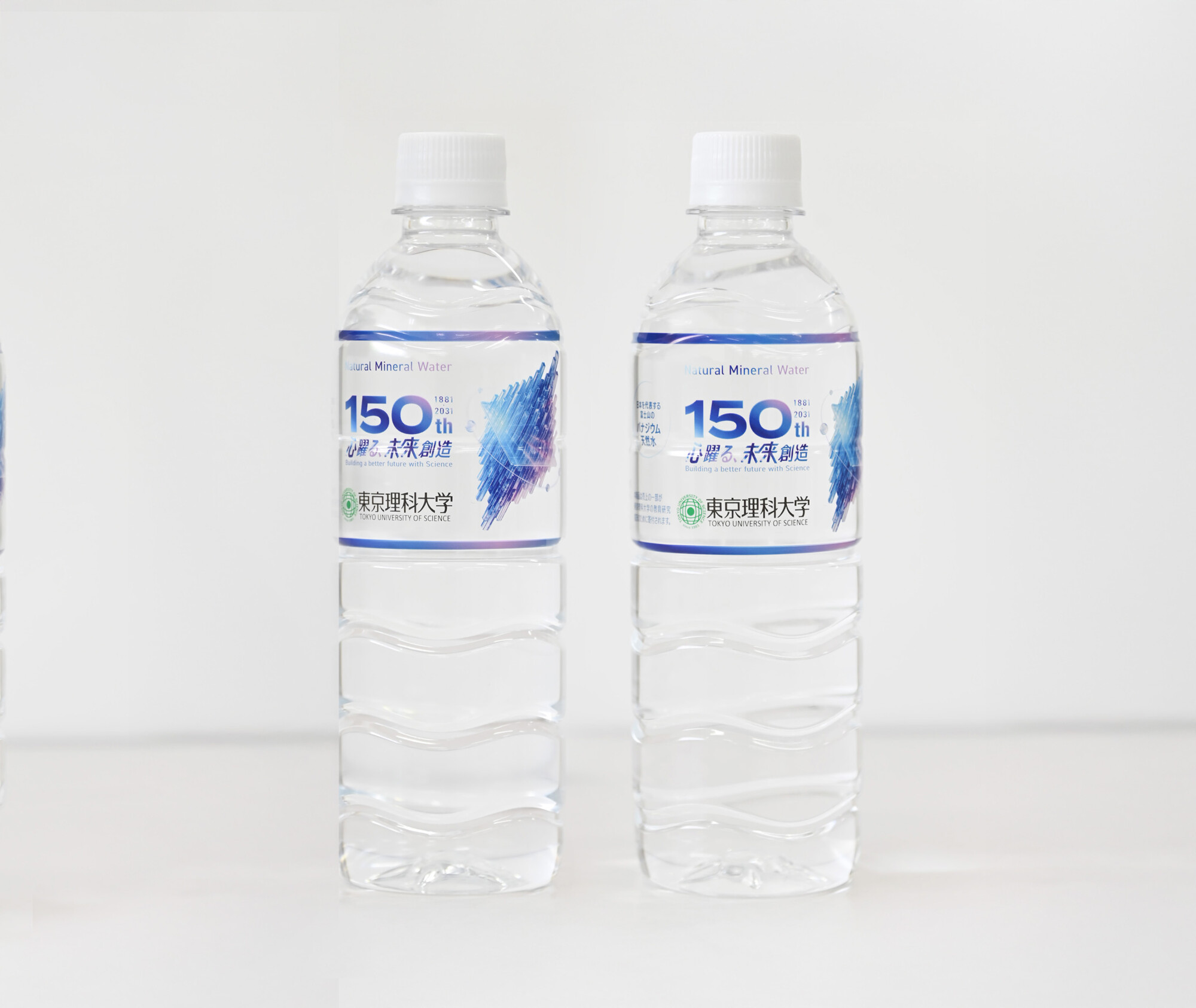
また、「東京理科大学 ナチュラルミネラルウォーター」のラベルのアートディレクションとデザインも担当しております。キャンパスの販売店(生協等)、自動販売機で販売中です。ぜひお買い求めください。
東京理科大学150周年準備サイト
SMDO was responsible for developing the visual concept for the Tokyo University of Science 150th Anniversary Project logo and key visual, as well as the logo design, art direction, and graphic design.
In addition, SMDO also handled the art direction and design for the label of the “Tokyo University of Science Natural Mineral Water.”
The product is currently available at campus stores, including the university co-op, and through vending machines across the campus. We encourage you to pick up a bottle if you have the opportunity.
■東京理科大学ナチュラルミネラルウォーター概要
1.採水地:山梨県南都留郡山中湖村
2.特長:日本を代表するバナジウム天然水の採水地である富士山周辺(山中湖)にて製造された軟水で、常温でも飲みやすく、料理にも合うお水です。
3.内容量:500ml
4.価格:100円(1本)(税込)


Label design
Art Direction : Minami Sano(SMDO)
Assistant Direction : Shinnosuke Nakasone(SMDO)
Chief Graphic Designer : Yuichi Ikehata(SMDO)
Graphic Designer:Yuichi Ikehata(SMDO)




東京理科大学 担当事例
150周年事業ロゴとキービジュアルのビジュアルコンセプトとロゴデザインの考案、アートディレクション、デザインをSMDOにて担当させていただきました。また制作グッズとしてポスター(2種類)、クリアファイルのアートディレクションとデザインも担当させていただきました。
Tokyo University of Science ~ 150th Anniversary Website
東京理科大学150周年サイトのWEBデザインも担当しております。理科大ならではのギミックや遊び心を随所に取り入れ、150年の歴史とこれからの未来を感じられるWEBサイトを目指しました。
Tokyo University of Science ~ Flag & Sign
フラッグ、看板のアートディレクションとデザインを担当させていただきました。。現在、野田キャンパスと葛飾キャンパスに掲載されております。
Tokyo University of Science ~ Nobel Prize Celebration Banner
佐野の母校でもある東京理科大学よりご依頼いただき、2026年ノーベル化学賞受賞を祝う記念横断幕のアートディレクションおよびデザインをSMDOにて担当しました。
Tokyo University of Science ~Interview
東京理科大学150周年サイトのWEBデザインを担当しました。
サイト内のインタビュー企画では、卒業生や教職員、学生それぞれの視点から、東京理科大学で培われてきた経験や学び、そしてこれからの未来について紹介しています。
Tokyo University of Science ~ RIDAIHITO
佐野の母校である東京理科大学様から取材のご依頼をいただき、東京理科大学報 第237号に掲載される「理大人」のコーナーでインタビューが公開れております。
nyamnyam Art Direction

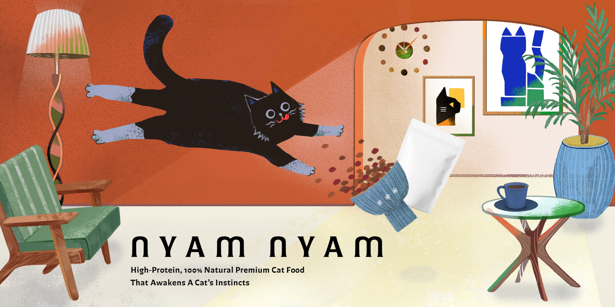
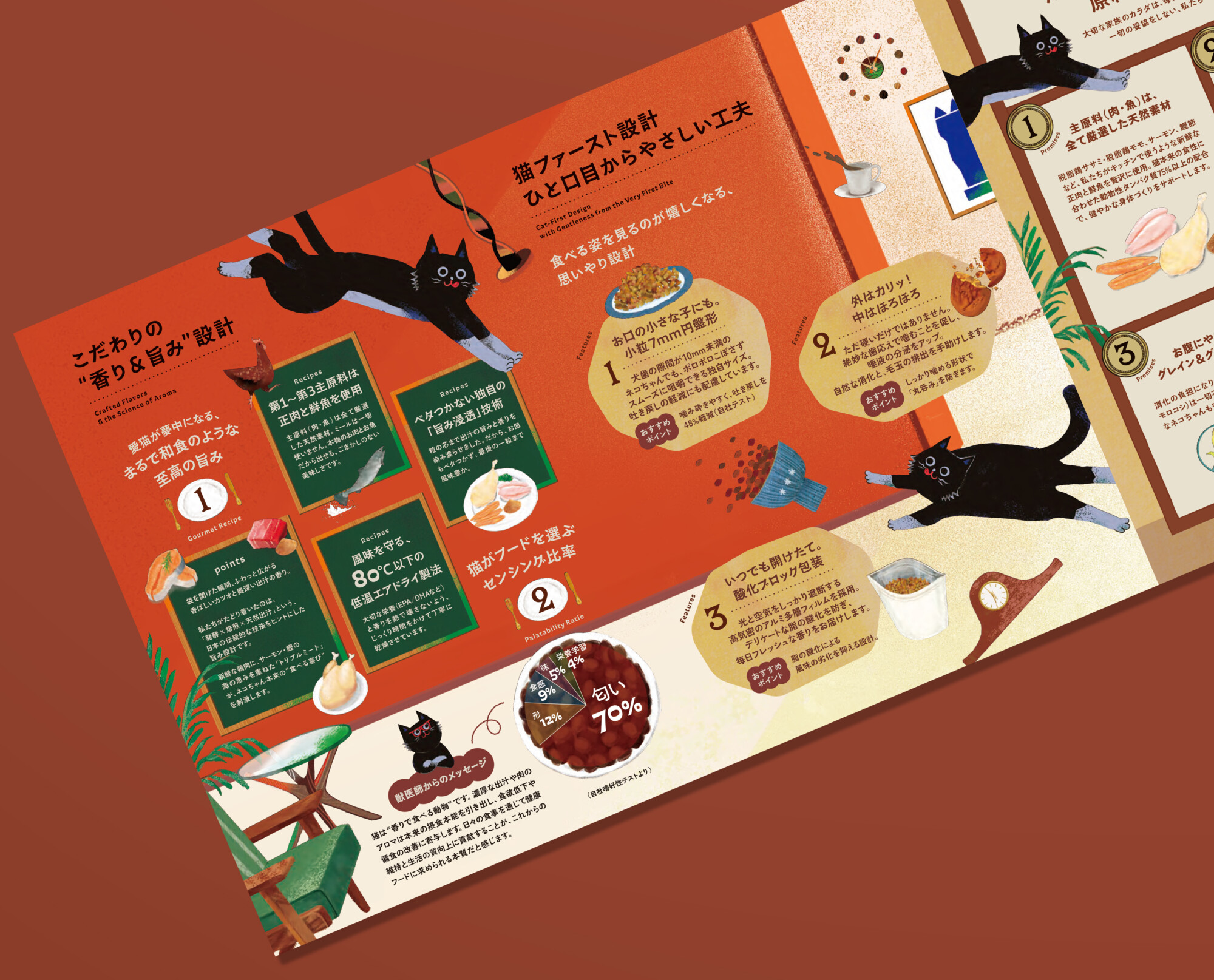
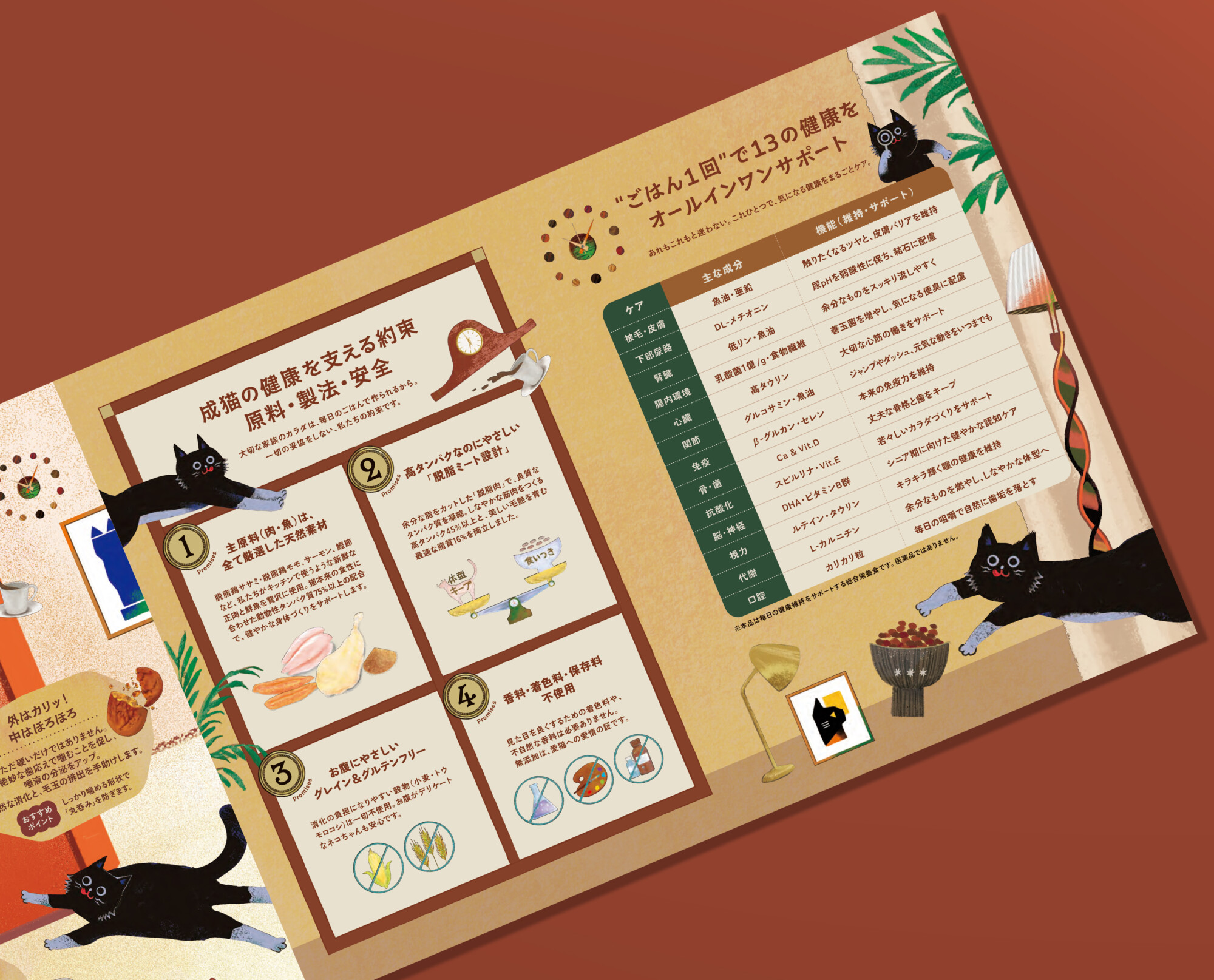
国産プレミアムキャットフィードブランド「nyam nyam」のパッケージ、キービジュアル、ロゴ、リーフレットのアートディレクション、デザイン、イラストをSMDOにて担当させていただきました。
愛猫家でもあるアートディレクター佐野が、猫の気持ち、愛猫家の気持ち、そしてその想いに寄り添うクライアントの気持ちを丁寧に汲み取りながら、時間をかけてご提案させていただきました。
「nyam nyam」のロゴタイプは、猫の柔らかく愛らしい丸みや、口元を逆さにしたような「m」の形をモチーフに設計しています。そこへ小さな歯や爪を思わせる、わずかに尖ったニュアンスを加えることで、猫らしい可愛らしさと活発さを表現しました。また、猫が美味しそうにフードを頬張る咀嚼音や、楽しそうに駆け回る足音を想起させるような、リズミカルな文字組みのバリエーション展開もご用意しています。
イラストでは、キャラクターの猫が思わず飛びついてしまうほどの美味しさを表現しながら、SNSや各種展開では、調べものをしたり、メガネをかけて「ふむふむ」と考えたりする姿など、豊かな表情や仕草を持つキャラクターとして描きました。
猫を愛するアートディレクターが、猫のことを真剣に考え抜いてご提案したビジュアルです。もちろんフードそのものも、長い時間をかけて開発され、こだわりが詰まった素晴らしい商品です。「nyam nyam」が、多くの愛猫家の皆さまに愛されるブランドへと成長していくことを願っています。
公式オンラインストア:https://nyamnyam.jp/

SMDO was responsible for the art direction, design, and illustration of the packaging, key visual, and leaflet for the Japanese premium cat food brand “nyam nyam.”
As a devoted cat lover himself, Art Director Sano took the time to carefully understand the feelings of cats, the emotions of cat owners, and the aspirations of clients who share and support that love, crafting thoughtful proposals with genuine care and attention.
The “nyam nyam” logotype was designed around the soft, lovable curves of a cat, with the letter “m” inspired by the shape of an upside-down cat’s mouth. Subtle pointed details reminiscent of tiny teeth and claws were incorporated to express both the charm and playful energy of cats.
We also developed rhythmic typographic variations that evoke the sounds of a cat happily munching on its food or the light footsteps of a cat playfully running around.


For the illustrations, we created a cat character that expresses the irresistible deliciousness of the food—so tasty that the cat simply can’t help but pounce on it. Across social media and other brand applications, the character was further developed with a rich range of expressions and gestures, from researching something with curiosity to thoughtfully pondering ideas while wearing glasses.
This visual identity was proposed by an art director who genuinely loves cats and carefully considered every aspect of feline behavior and personality throughout the creative process. Of course, the food itself is equally special—a thoughtfully crafted product developed over many years with great dedication and attention to quality.
We hope that “nyam nyam” will continue to grow into a beloved brand cherished by cat lovers everywhere.


Package design
Art Direction : Minami Sano(SMDO)
Assistant Direction : Shinnosuke Nakasone(SMDO)
Chief Graphic Designer : Yuichi Ikehata(SMDO)
Graphic Designer:Yuko Onda(SMDO)
AssistantDesigner:Sachiko Fukuoka(SMDO), Machiko Terada(SMDO)
Ilust: Matsurica(SMDO), Sayaka Yamashita(SMDO),Fumiko Yamane(SMDO), Marumiya(SMDO)
Cliant : オーイズミ下仁田
Agent : 株式会社Bricolage&Lo
Supervision / Production : Masahiro Ryohara (RINN Inc.)


KV design
Art Direction : Minami Sano(SMDO)
Assistant Direction : Shinnosuke Nakasone(SMDO)
Chief Graphic Designer : Yuichi Ikehata(SMDO)
Graphic Designer:Sachiko Fukuoka(SMDO) , Mariko Adachi(SMDO), Machiko Terada(SMDO)
AssistantDesigner:Maiko Shimohiro(SMDO), Miki Asakawa(SMDO)
Ilust: Matsurica(SMDO), Sayaka Yamashita(SMDO),Fumiko Yamane(SMDO), Marumiya(SMDO)


Leaflet design
Art Direction : Minami Sano(SMDO)
Assistant Direction : Shinnosuke Nakasone(SMDO)
Chief Graphic Designer : Yuichi Ikehata(SMDO)
Graphic Designer:Maiko Shimohiro(SMDO)
AssistantDesigner:Romi Nakano(SMDO)
Ilust: Matsurica(SMDO), Sayaka Yamashita(SMDO),Fumiko Yamane(SMDO), Marumiya(SMDO)




Logo design
Art Direction : Minami Sano(SMDO)
Assistant Direction : Shinnosuke Nakasone(SMDO)
Chief Graphic Designer : Yuichi Ikehata(SMDO)
Graphic Designer:Anju Mori(SMDO)
AssistantDesigner:Machiko Terada(SMDO)

下図:WEBサイトにもご使用いただいております。
※WEBデザインはSMDOでの作成ではありません。


WEB広告もご使用いただいております。
※広告デザイン、写真撮影はSMDOでの作成ではありません。


LuLuLun CAFFEINE SERUM SHOT


フェイスマスクブランド ルルルン(LuLuLun)様より発売された「カフェインセラムショット」のKVのアートディレクションとデザインをSMDOにて担当させていただきました。
※パッケージデザインはSMDOでの作成ではありません。
SMDO was responsible for the art direction and design of the key visual for “Caffeine Serum Shot,” released by the face mask brand LuLuLun.
※The package design was not created by SMDO.


Art Director : Minami Sano (SMDO)
Assistant Director : Shinnosuke Nakasone(SMDO)

Tokyo University of Science ~ Flag & Sign

佐野の母校でもある東京理科大学様からご依頼いただき、150周年事業ロゴとキービジュアルのビジュアルコンセプトとロゴデザインの考案、アートディレクション、デザインをSMDOにて担当させていただきました。またフラッグ、看板のアートディレクションとデザインも担当しております。現在、野田キャンパスと葛飾キャンパスに掲載されております。
東京理科大学150周年準備サイト
SMDO was responsible for the development of the visual concept and logo design for the 150th anniversary of Tokyo University of Science—Sano’s alma mater—as well as the art direction and design of the key visual. SMDO also handled the art direction and design of flags and signage.It is currently featured on the Noda Campus and the Katsushika Campus.

野田キャンパス

.
Flag design
Art Direction : Minami Sano(SMDO)
Assistant Direction : Shinnosuke Nakasone(SMDO)
Chief Graphic Designer : Yuichi Ikehata(SMDO)
Photographer : キリコシマキ
cliant : Tokyo University of Science


Sign design
Art Direction : Minami Sano(SMDO)
Assistant Direction : Shinnosuke Nakasone(SMDO)
Chief Graphic Designer : Yuichi Ikehata(SMDO)
Photographer : キリコシマキ
Graphic Designer:Romi Nakano(SMDO)
葛飾キャンパス


東京理科大学 担当事例
150周年事業ロゴとキービジュアルのビジュアルコンセプトとロゴデザインの考案、アートディレクション、デザインをSMDOにて担当させていただきました。また制作グッズとしてポスター(2種類)、クリアファイルのアートディレクションとデザインも担当させていただきました。
Tokyo University of Science ~ 150th Anniversary Website
東京理科大学150周年サイトのWEBデザインも担当しております。理科大ならではのギミックや遊び心を随所に取り入れ、150年の歴史とこれからの未来を感じられるWEBサイトを目指しました。
Tokyo University of Science ~ Plastic Bottle Label
「東京理科大学 ナチュラルミネラルウォーター」のラベルのアートディレクションとデザインも担当しております。キャンパスの販売店(生協等)、自動販売機で販売中。
Tokyo University of Science ~ Nobel Prize Celebration Banner
佐野の母校でもある東京理科大学よりご依頼いただき、2026年ノーベル化学賞受賞を祝う記念横断幕のアートディレクションおよびデザインをSMDOにて担当しました。
Tokyo University of Science ~Interview
東京理科大学150周年サイトのWEBデザインを担当しました。
サイト内のインタビュー企画では、卒業生や教職員、学生それぞれの視点から、東京理科大学で培われてきた経験や学び、そしてこれからの未来について紹介しています。
Tokyo University of Science ~ RIDAIHITO
佐野の母校である東京理科大学様から取材のご依頼をいただき、東京理科大学報 第237号に掲載される「理大人」のコーナーでインタビューが公開れております。